I recently completed Ghost of Yotei, a game I had been looking forward to ever since I put the controller down with Ghost of Tsushima. I had been itching for a game like this where it sets you free into a beautifully crafted world and just lets you explore at your own pace. There is an tremendous level of restraint the creators have put into this game to make sure that you can soak in all the beauty of the world they’ve created, and they made sure that nothing got in the way of that. They succeeded and hit a real home run with this one.
In general, the game’s commitment to not having any on-screen HUD (at least when not in combat) is astounding in itself. It makes use of guiding wind, a returning fan-favorite feature from the previous game, to let you orient yourself in the world. This time around, you can even use shamisen songs to navigate to specific points of interest. But the one thing I’m absolutely floored by is how well it manages to incorporate literally all of the game’s important information on one screen: the map.
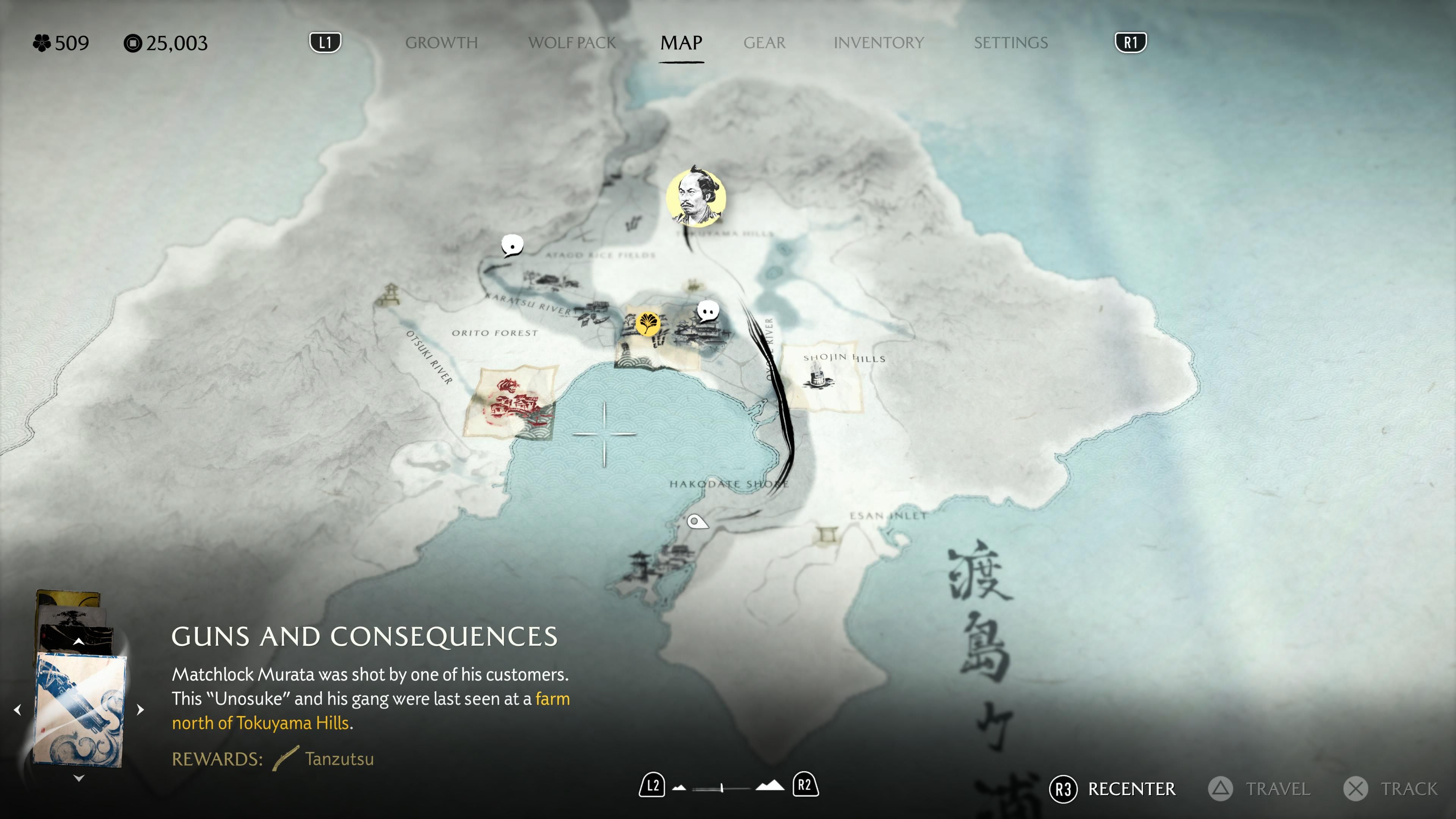
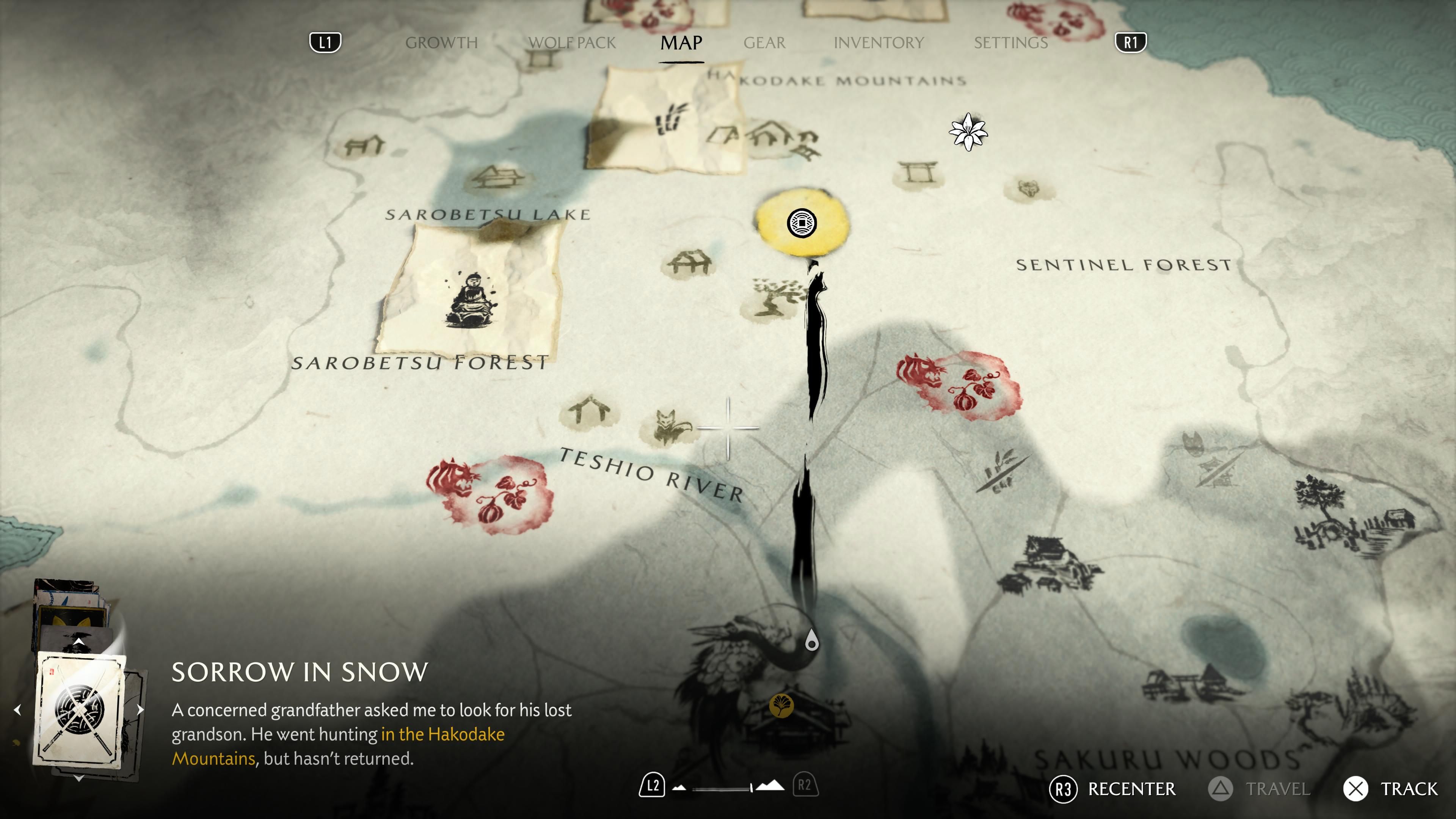
Usually, open-world RPGs like this have an entirely separate view called Quests or Missions where you track side content, the main story, bounties, optional collectibles, etc. But not Ghost of Yotei. Sucker Punch went above and beyond to just have the map do all of that work. On paper, this sounds impossible but the execution here is rock solid: all the information you would ever want to know about a shrine or new weapon or armor is displayed directly on the map as you hover over various map pins. There’s just no need for an entire quest tracker with detailed descriptions of your progress or what you need to do next to proceed. You track your progress in the game visually by how many map markers you’ve cleared. If they’e still highlighted prominently, it means there’s something you need to do there.
The game uses illustrated cards with a visual anchor for each quest to track it, allowing you to cycle through several of them in a set to view where you need to go to progress it. The main quests are gold cards, Sensei cards are blue, Tales cards are gray, Myths are black cards, and Bounties typically show illustrated mugshots of your target. This system of using cards in a small view on the bottom-left of the map works so brilliantly because it brings the player’s mental models of “What do I need to do?” and “Where do I need to go to do it?” into the same surface and allows them to chart the path for their journey’s next leg with ease. I also love how it doesn’t infodump paragraphs of text onto you and just gives you a one-line description of what that quest is.
What’s impressive here is how well this system scales. This card system can show progress indicators on it, letting you track how many X of Y items you’ve completed and how many remain. All the quests in the game are designed to fit with this model of how they’re communicated to the player on the map view. All of the quests are linear without much player choice in how to proceed, so there isn’t a need for displaying options or differing outcomes.
For every type of quest, all the critical information that a player would need to know is still shown on the card descriptions. Myths typically reward you with new gear, and it directly displays the reward you’ll get for completing it on the card, encouraging and softly nudging players to prioritize that over the rest of the side content as it has very direct gameplay benefits. I’m impressed with how many different variations of the quest card and descriptions there are while it feeling very seamless and intuitive in-the-moment.
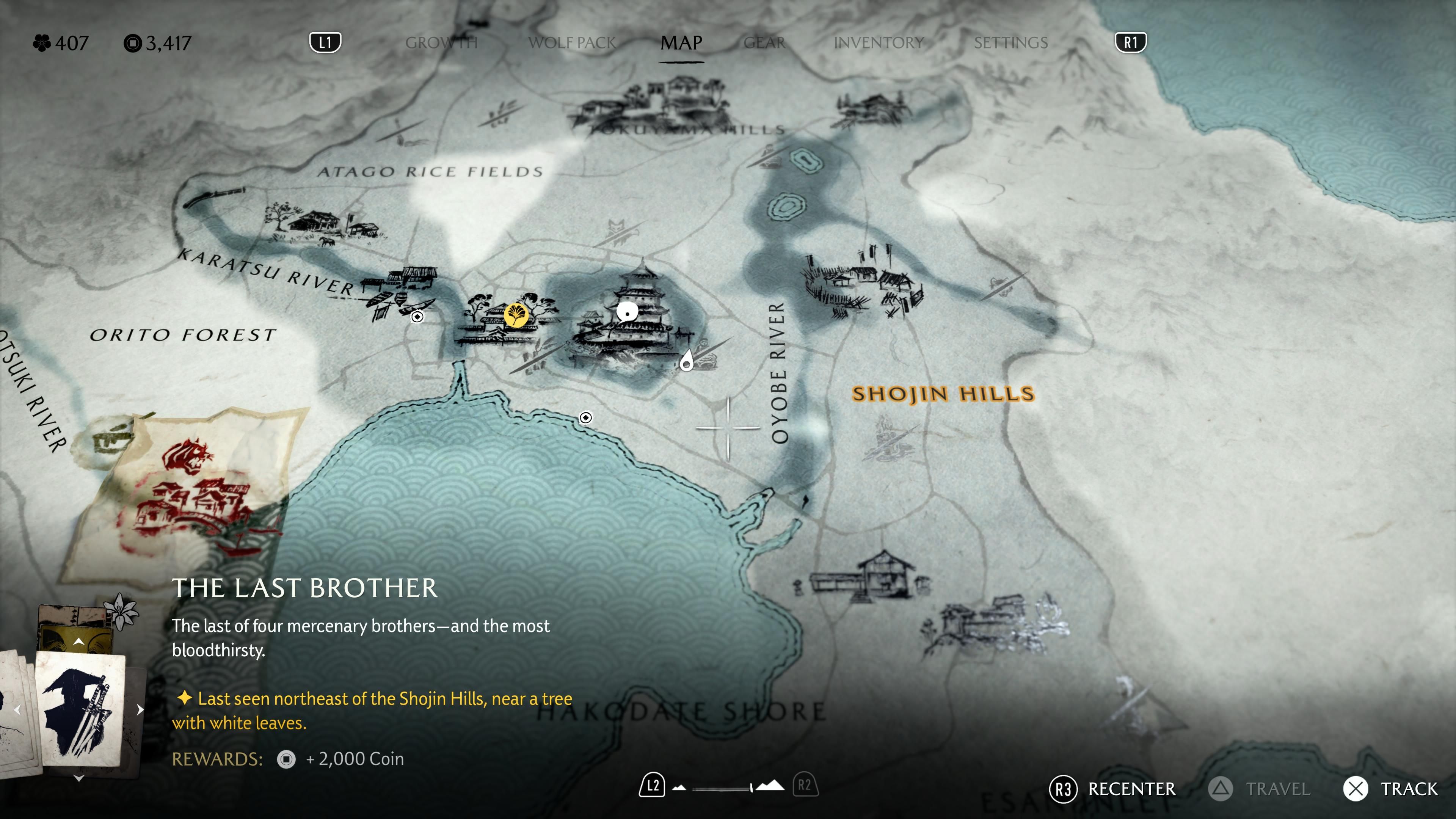
In the spirit of letting the player actually explore and discover the world, the game will often give you just a vague description like “This enemy was last seen near a mountain range” and let you piece the puzzle together yourself. It often highlights the area on the map as a place to go investigate later. This system is a hundred times more engaging than the antiquated question marks “?” that tend to litter the map and overwhelm the player in these types of games. I found myself way more interested in exploring and going to these places than I ever did in games that dropped question marks all over their maps.
The visual style of the map’s design is also stunning, evoking the traditional practice of Sumi-E ink paintings and Japanese cartography methods of the era that the game is set is. The main character Atsu herself paints that way, and there is some narrative exposition implying that Atsu is drawing these maps herself as she looks at objects with her spyglass and fills in the details on her travels. When you first mark an object with your spyglass, the location gets a generic label like Shrine or Village on the map, but as you reach the location in the game world, it updates with its actual icon and name, paralleling how you would organically find and discover these through exploration. Map markers fade out as you complete them, letting the incomplete or in-progress ones take the spotlight so that your focus is on the places you haven’t been to and not the ones you’ve already been to. The map even has its own special effect when it’s raining with droplets softly hitting the ink and spreading out on the paper! The attention-to-detail here is absolutely delightful.
And the quality of life improvements the map brings cannot be understated. When choosing a location to fast travel to, the game asks you where in that location you’d like to go. Merchants, and important locations are usually scattered around the town and finding them can be a hassle sometimes, especially if you’re not intimately familiar with the settlement layouts. Better yet, the game marks the map with a red dot when there’s new items available at a merchant, eliminating the second-guessing about when stores restock their wares or new items become available.
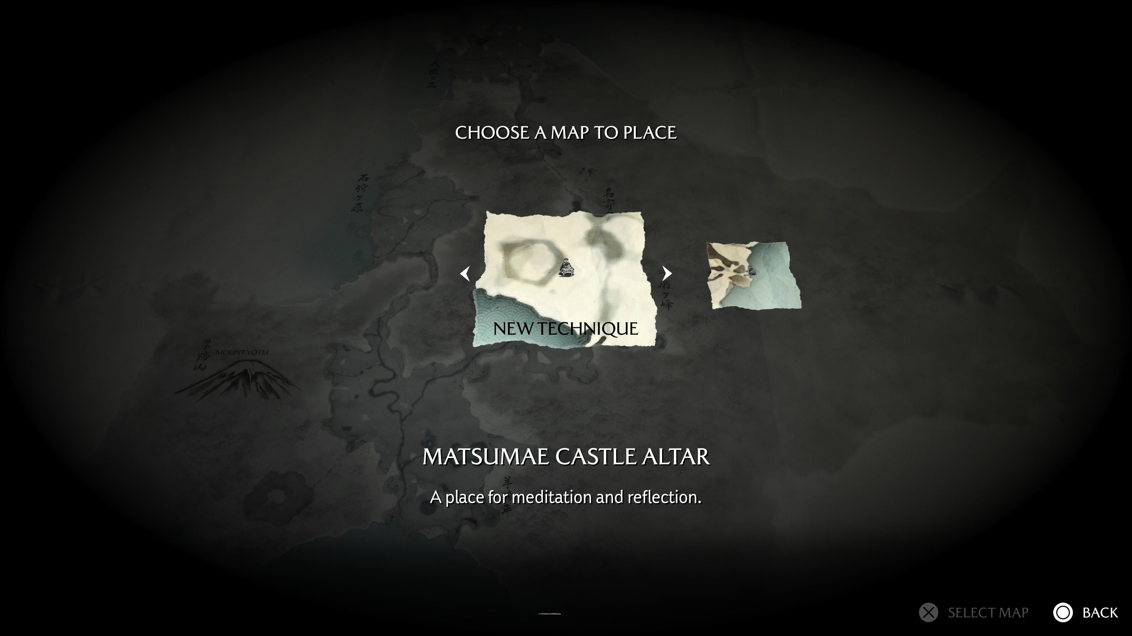
I also really appreciate how integrated discovering points of interest has become in this game. When you’re wandering around the world, a passerby will sometimes remark that there’s a bamboo strike or a fox den nearby and give you a map fragment, which you then have to physically place on your map in the right spot by using the geographic features in the map fragment as a guide. I thought that this was a simple yet just-engaging-enough mechanic to let you do some work to find locations. Manually placing them also reinforces to you that you should probably go there at some point. Best of all, you can directly purchase these map fragments from Isaburo the Cartographer, my personal favorite NPC in the game who I’m left wishing got some more character development.
All in all, I’m very impressed with how much heavy lifting the map is doing in this game. Most players probably won’t even notice this because of how seamless and integrated it all feels. Good design is invisible, and this is a standout example of genuine innovation in game UI where the focus on essentialism to only deliver just the right amount of information to continue with a quest and let players organically discover the world really shines. I felt like I was truly exploring the world for myself and was using the map as a rough guide to plan out my path or activities, and it worked brilliantly.
I hope more games take this approach of integrating quest tracking directly into their map and deeply consider what information needs to be displayed on the map before throwing a hundred icons on there and overloading the player with 50 things to mark off a checklist. I’m always put off by those games and tend to drop them, so I loved seeing Ghost of Yotei set a new standard here.