I was the Design Lead on this project leading the initial pitch, driving the strategy, and setting the vision. I had a rotating team of 2-3 Design ICs that I was working with during the concepting phase for the first three months to speed up iteration & execution cycles, after which I was the sole designer on the project leading the scoping, tech build, and phased rollout to 100% of global markets over the next year.
Background
When I joined the Dasher design team at DoorDash, it was clear that the Dasher app needed some serious work. A decade’s worth of feature bloat without governance had led to poor usability and messy UX across the board. The homescreen was the place to start as it had become the de-facto dumping ground for new feature announcements, in-app education, and entry points to the rest of the app. I audited the app with my design partner Ruolan Xia and made a case for why this experience was in desperate need of a redesign.
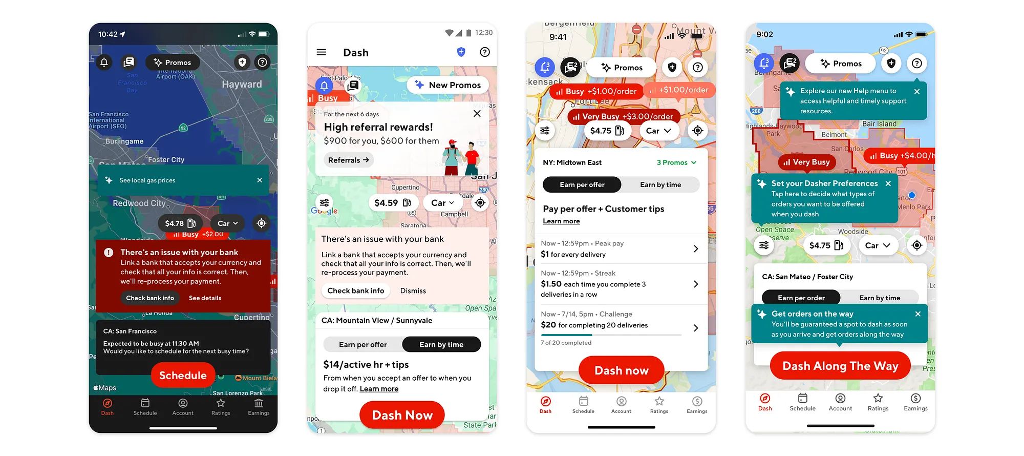
When a Dasher opened the app, the #1 thing they were looking to understand was whether or not it was a good time to earn in their area. Instead, they got blasted with dozens of irrelevant pop-ups, tooltips, banners, and messages that completely blocked them from interacting with the map and made it difficult to understand whether or not it was a good time to dash.
“There’s too much going on in my home screen. It makes me stressed...and I don’t want to think and drive. That’s dangerous.” - Dasher
Initial approach
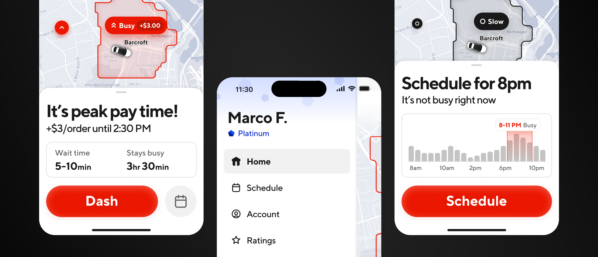
The homescreen had lost its focus on dashing. This was lowering dash conversion, the most important business metric that DoorDash used to measure, balance, and optimize the supply of Dashers on the road to fulfill the demand (outstanding DoorDash orders) on the platform. This was my primary anchor throughout the project to ground the design direction towards this singular goal, which is to increase dash conversion. I wanted Dashers to open the app and tap the Dash button within 2-5 seconds if it was a good time to dash.
One of the first things I did is work with our Analytics team to go deep on how the homescreen was being used today. It’s not great to have 20+ buttons on the homescreen, but it’s also risky and reckless to remove them all without fully grasping how it might impact other metrics and user behavior. I mapped out all the buttons and their tap rates in a given session across a range of Dasher personas, regions, and cohorts to better understand current usage. I then talked to all the product teams that owned these features to figure out how it ended up on the homescreen and what their concerns of removing them were. I wanted this project to be vision-led and data-informed.
Defining a framework
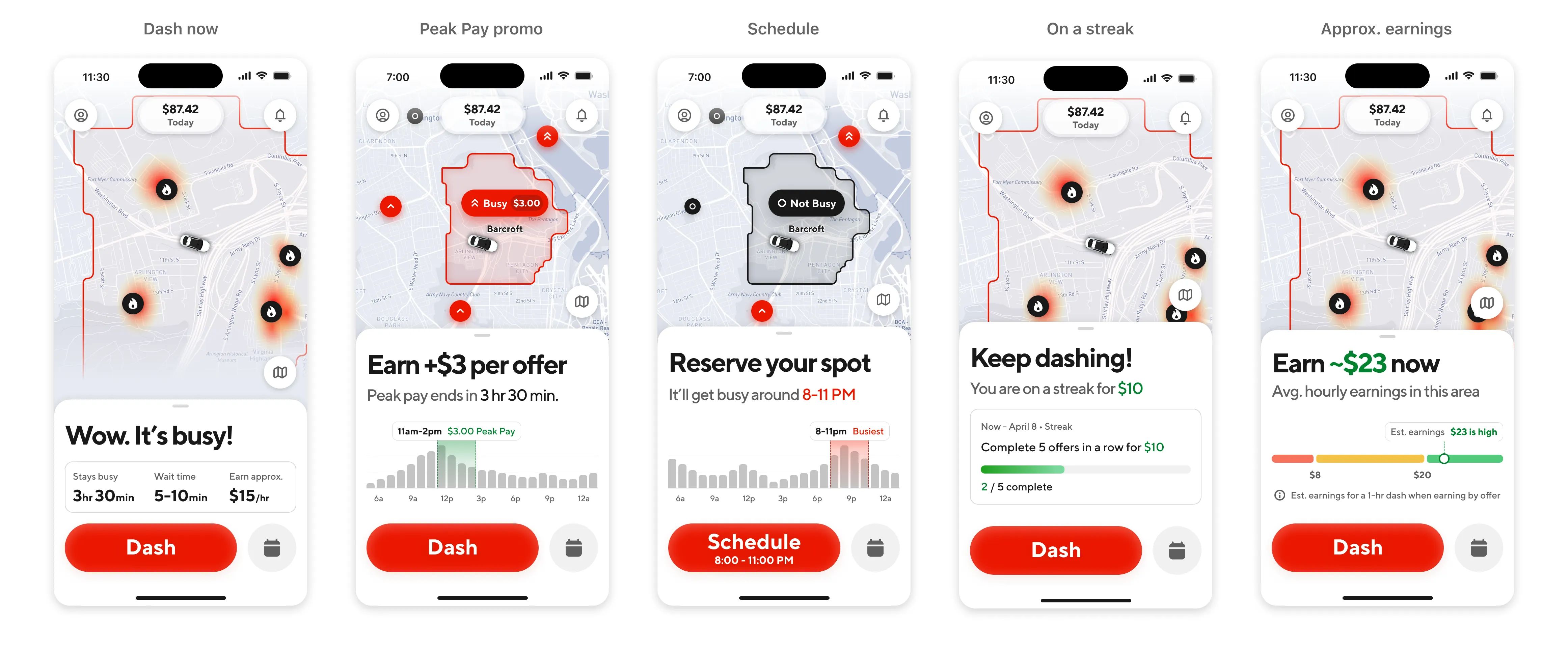
As my understanding of the problem space grew, I was also forming a point of view on what the Job To Be Done of the homescreen actually was. An area could be undersupplied (where there’s more orders to be fulfilled than there are Dashers to fulfill them) or it could get oversupplied (where there’s more Dashers than orders to be fulfilled). I used this market strategy as a guiding framework to map out the main scenarios that the homescreen needed to accomplish.
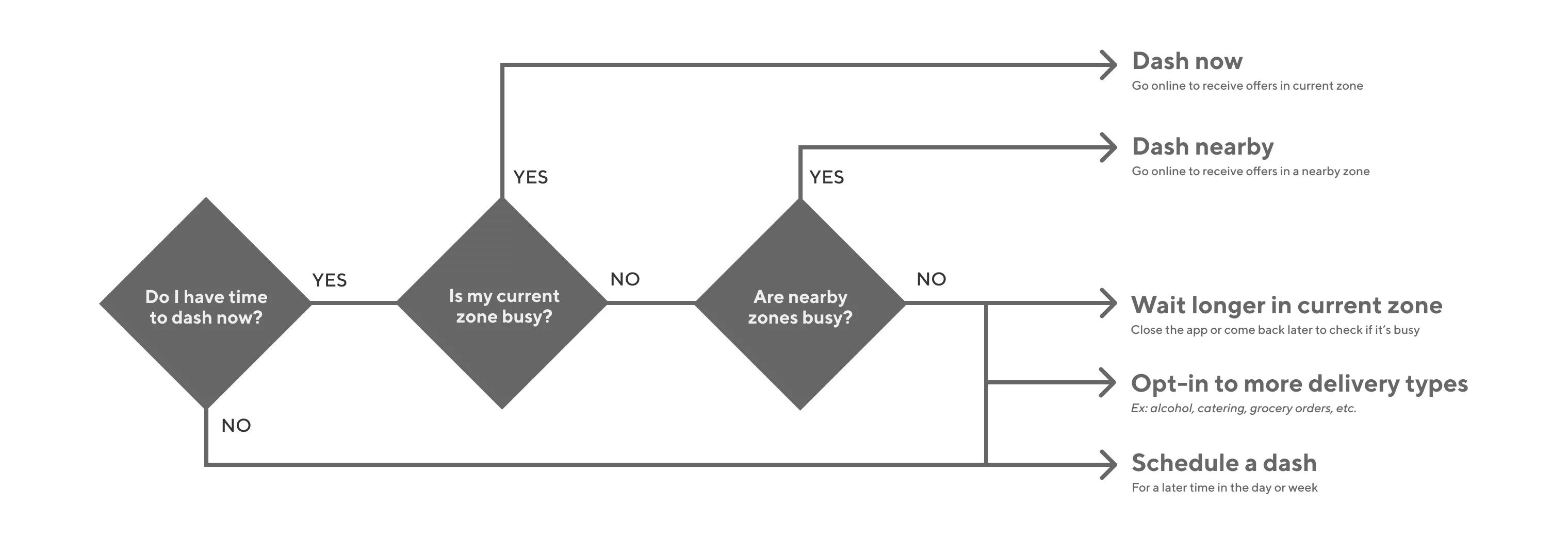
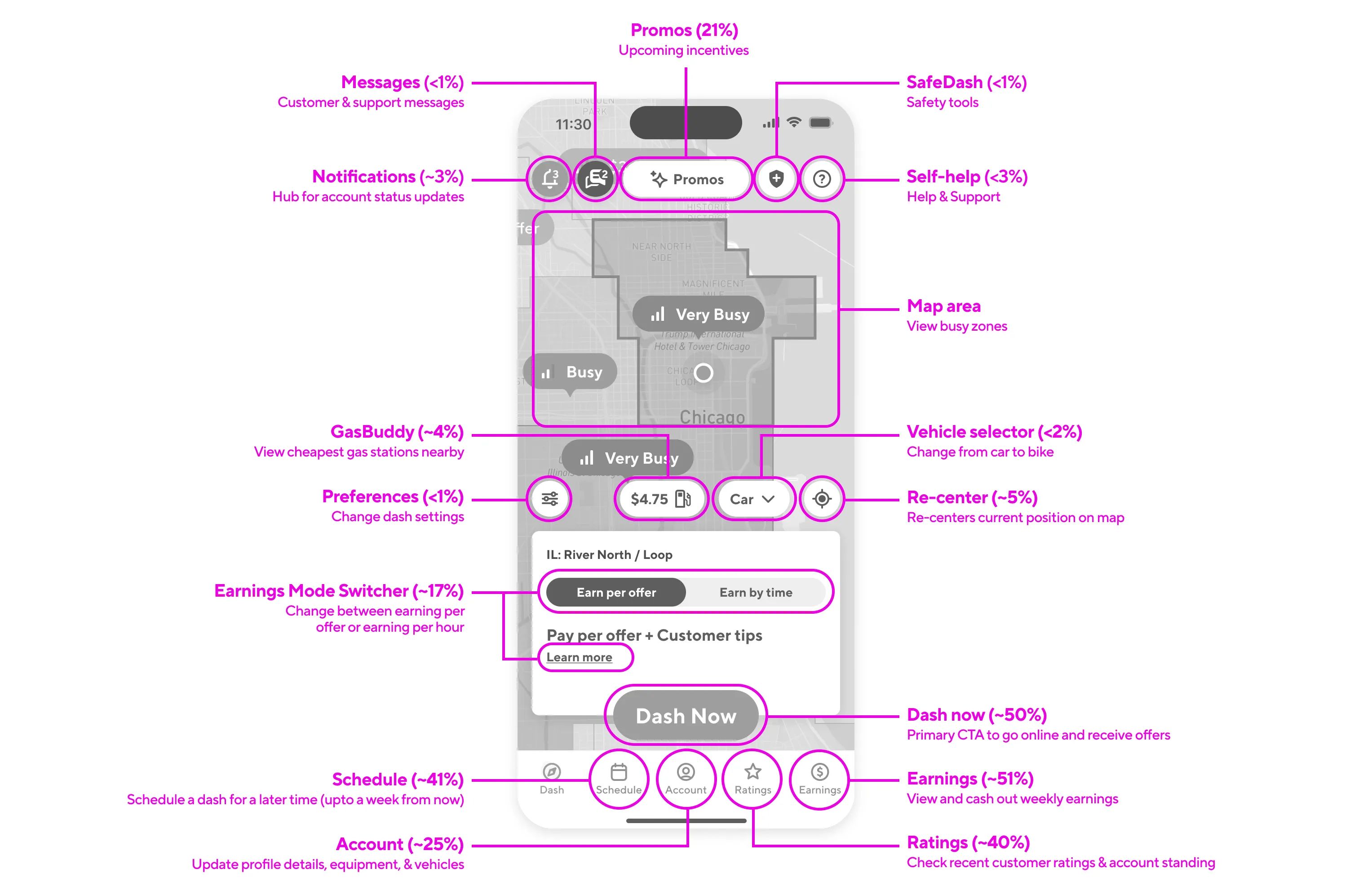
I combined this thinking with the research insights from our early concept tests to inform how the overall information architecture of the homescreen should be structured. I wanted to focus the view on 3 main core intents:
- Dashing now
- Dashing later
- Checking earnings
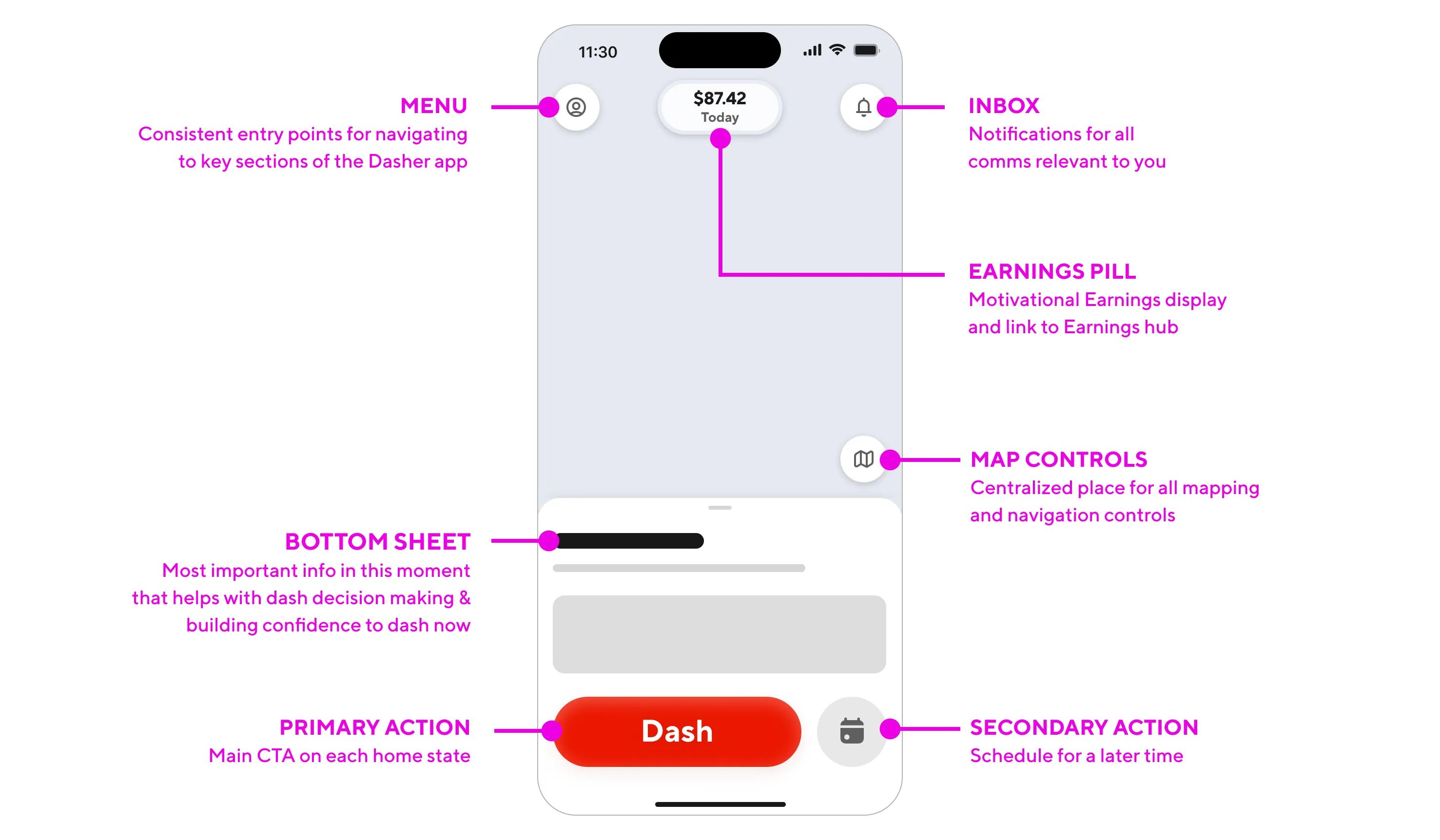
This IA gave earnings the center stage treatment, reassuring Dashers that this was first and foremost an earnings platform. The two core actions of dashing and scheduling were the main actions in the sheet in easy thumb reach. Aside from those core intents, we needed a few more elements accessible from the homescreen to flesh out the UI. For a full breakdown of all the design explorations and ideas we tested to land on this final IA, check out the full-length design deep dive on Medium.
A simplified strategy
To bring an opinionated point of view and simplify the homescreen, I wanted to channel radical simplicity with the redesign. This brought echoes of one of my favorite blog posts, The Beauty of Simplicity, where Google’s then-CEO Marissa Mayer talks explains how she managed to keep Google’s homepage dead simple:
“Google has the functionality of a really complicated Swiss Army knife, but the home page is our way of approaching it closed. It’s simple, it’s elegant, you can slip it in your pocket, but it’s got the great doodad when you need it. A lot of our competitors are like a Swiss Army knife open--and that can be intimidating and occasionally harmful.” - Marissa Mayer
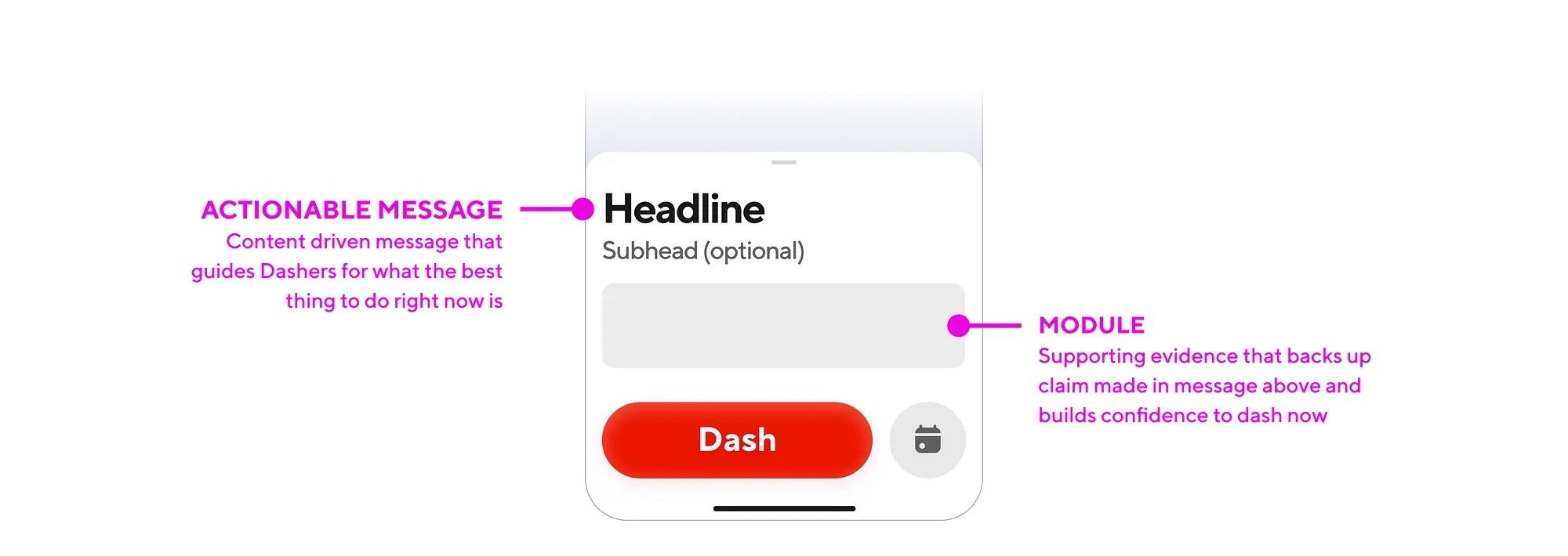
The persistent bottom sheet in our design was not scrollable and could only display short phrases of text with an informational module. This was a very intentional design decision to ensure that we don’t overload the homepage with the hundred things it could do and keep it focused on the main thing it should do in that moment. When executed right, this Swiss Army knife approach is a powerful conceptual model that feels like it seamlessly adapts to meet and often predict a user’s needs when they land on the homescren.
“It gives you what you want, when you want it, rather than everything you could ever want, even when you don’t.” - Marissa Mayer
Showcasing how this new model of replacing content in the bottom sheet instead of adding content onto a sheet (as you would normally expect to do) was critical in communicating the flexibility and adaptability of this framework. I went on an internal roadshow with this and got all the different stakeholders on-board with the idea.
Making our map useful
The map took up a lot of the visual prominence on-screen and was the first thing a user’s eyes are drawn to. It didn’t get the love it deserved previously with everything overlaid on top, and it was also doing too much before. I wanted to bring the ethos of essentialism to the map as well and simplify what we’re communicating on the map.
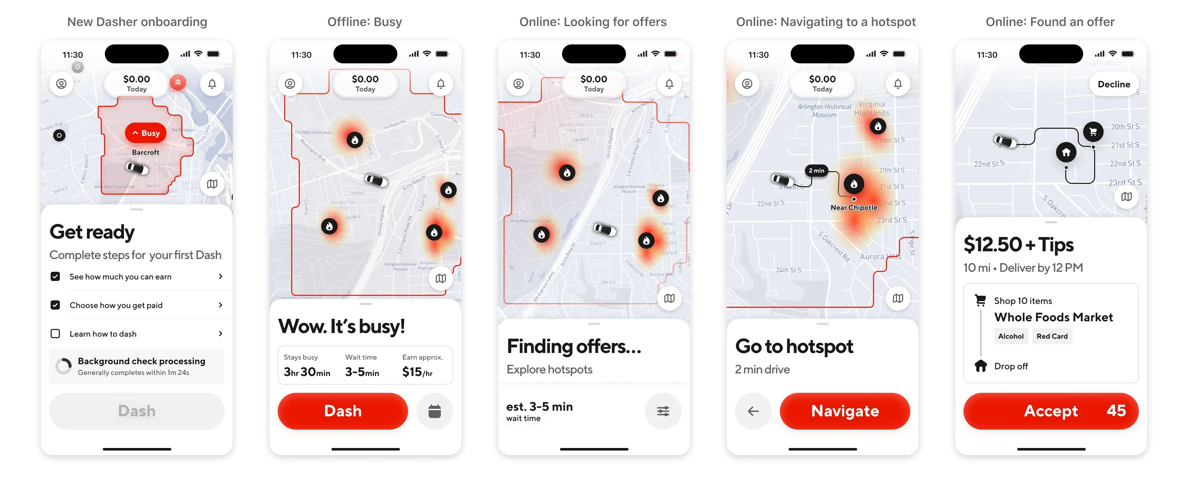
When a user pans, drags, or zooms on the map, they’re signaling a change in their intent. They’re mentally switching from being ready to dash now to going into more of an exploration mode. I wanted to lean into this intent and have the map dynamically respond to gestural interactions on the map. My Design Systems partner Matthew Burg refined all these details while I led overall strategy and conceptual direction.
When you zoom in, the map shows granular busyness at specific hotspots. When you zoom out, the map pins shrink to allow for a quick bird’s eye view of the busyness in a wide geographical area. The boundary of an area only displays when you’ve physically selected it and indicated an intent to learn more about it. These details are all in service of getting you to quickly make a decision of where to dash and tap the big red “Dash” button to start earning.
The design vision
The new IA focused on core intents, the Swiss Army knife sheet framework, and the map simplification updates all work together in harmony to create a design language for the homescreen that brings back the focus to dashing. Every time you open the app, you may see a different view with dynamic content but it all stays familiar with the same UI framework and patterns that you’re used to.
One thing I really wanted to ensure was that this framework would work beyond the homescreen, for the entire Dasher app. I adapted the design patterns we were using here to the online state after you tap Dash as well as the offer screen where Dashers make accept or decline decisions. We worked closely with our Design Systems partners Lauren Prasad & Tony Ferreira to ensure that the new components we were creating would scale to the whole app.
The beauty of reusing the same visual framework across the app is that the product maintained a consistent and predictable look & feel across the dashing journey. Now we weren’t just talking about the homescreen but were also simplifying the app launch experience to load the app faster and get Dashers to their first earnings opportunity as quickly as possible after they tap the Dash button. Pitching it this way ensured that we got buy-in for the long term.
Scoping and building the MVP
To ensure that this vision didn’t fizzle out in a slide deck never to be seen again, I worked closely with our Product & Engineering teams to scope the work in a way where could ship a first milestone within 6 months. This was audacious, but doable using the cupcake philosophy of product development. I was adamant that we needed to build the entire core IA and Swiss Army knife sheet framework as a whole, or else the entire design fell flat and didn’t accomplish our goals. The one thing we descoped was the map updates, as it required a deeper platform investment to maps as a whole to pull off what we wanted.
The thing I’m most proud of is all the little micro-animations and moments of delight we sprinkled into the experience. Every UI component animates into the view with a graceful and soft transition. We used motion very intentionally to draw attention to specific elements that we wanted to bring focus to, like showcasing your weekly earnings or highlighting a time range on a graph. I worked with our Motion Designer Eric Henry to define a framework for how these animations would be triggered, choreographed, and sequenced when the app loads. We really went deep and sweated the details on every single frame to get this right.
The secret final boss of the MVP was our messaging framework. Not everything that we needed to communicate to users directly related to dashing, which meant that we couldn’t use our bottom sheet for it. So we needed a proper Comms Platform to handle all of this messaging. My design partner Ruolan Xia took on this daunting task of creating a few preset templates with usage guidelines for how we communicate critical account information like account blocks, deactivations, issues with direct deposit, etc.
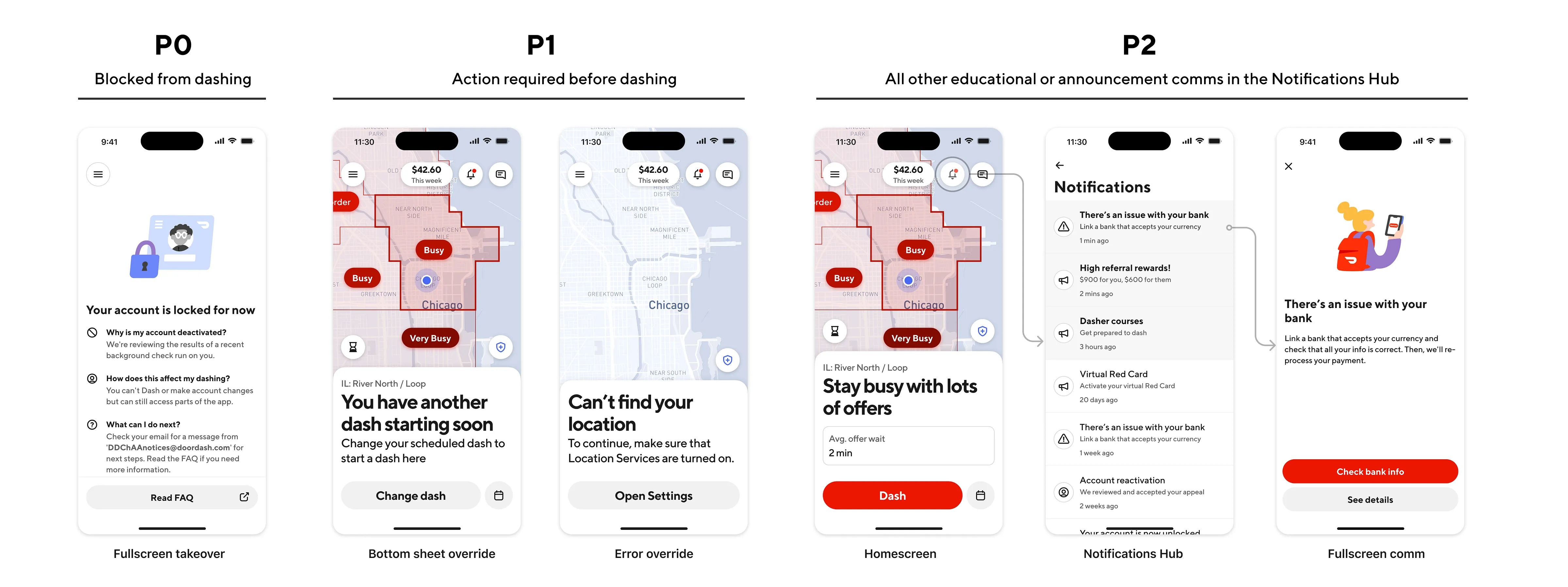
Every single team at the company had to migrate their banner or tooltip into one of these preset templates, and this was a mammoth effort that was happening in the background of the main MVP build. Most of these would end up in the Notifications Hub, accessed by tapping the ringing bell on the top-right of the redesigned homescreen. It took another 6 months to migrate and build the tech infrastructure for this new Comms Platform, and it was a must-have to roll out in regulatory markets with strict legal requirements on what we needed to communicate to users when they opened the app.
The launch and rollout
We began a phased rollout in US markets first while closely monitoring our success metrics and any shifts in guardrail metrics for other features that were tied to the homescreen. I worked with our Product Marketer Alex Diaz and his team to showcase all the new goodness in our redesign that came directly from user feedback about what they’d like to see updated in the Dasher app.
After we ramped up to a critical mass, we saw positive movement in all our core metrics across the board (exact numbers not disclosed):
- More Dashers were starting dashes from the homescreen
- Dashers were making the decision to dash faster than before
- New Dashers were starting dashes more frequently
This gave us the green light to begin the full worldwide rollout of the redesign to all markets. I was personally pleased to see that the data we were seeing directly reflected the instinct and intuition with which we made a lot of the early design decisions based on conviction, grit, and some directional research insights about what the right experience would be. We made a launch announcement about it before an earnings call and Bloomberg highlighted the project as a landmark improvement to the Dasher app.
Legacy and impact
This was the single biggest redesign in the entire Dasher app in the twelve years that it had existed. It not only gave the broader Design & Product teams at DoorDash the confidence to take big swings like this, but also elevated the role of the Design discipline in leading transformative initiatives like this across the org. On top of all this, we greatly improved engineering velocity by moving everything to a server-driven UI framework and coupling this redesign with a full technical rewrite of our homescreen architecture, which paved the way for rapid experimentation and updates to the homescreen going forward.
The team began building the next phase of work after the MVP shipped, which is the online state when a Dasher is waiting for offers. The plan is to then continue investing in the maps platform to create a dynamic, responsive map. I’m glad to see this effort go beyond just a redesign of the homescreen to a more comprehensive reimagining of the entire app for our users.
For a longer version of this case study that dives into all the nitty gritty details, check out the full-length design deep dive on Medium.