I was the lead designer on this project working with a cross-functional team over a course of fifteen weeks to fully overhaul the Lyft driver deactivation experience with a transparent, empathetic, and actionable design that scaled to all critical notifications. This resulted in big metric wins for Lyft’s business as well as positive feedback from drivers about the clarity and level of detail shown in the updated screens.
Background
If you were a Lyft driver that had just dropped off a rider, you could suddenly and unexpectedly be kicked off your shift, resulting in lost income for drivers and fewer drivers on the road for Lyft. The in-app message you received was a pop-up alert on the homescreen that was vague, unclear, and didn’t have much information about what happened or why.
After dismissing the message (which drivers often did by mistake), there was no way to see it again. Once gone, it was gone forever. The affected drivers received a boilerplate email from Lyft Safety, which was frequently missed because most drivers weren’t actively monitoring their email for communications from Lyft. This design completely failed at communicating the urgency of the issue and resulted in drivers filing multiple support tickets with Lyft over phone, email, and chat to figure out what happened to their account.
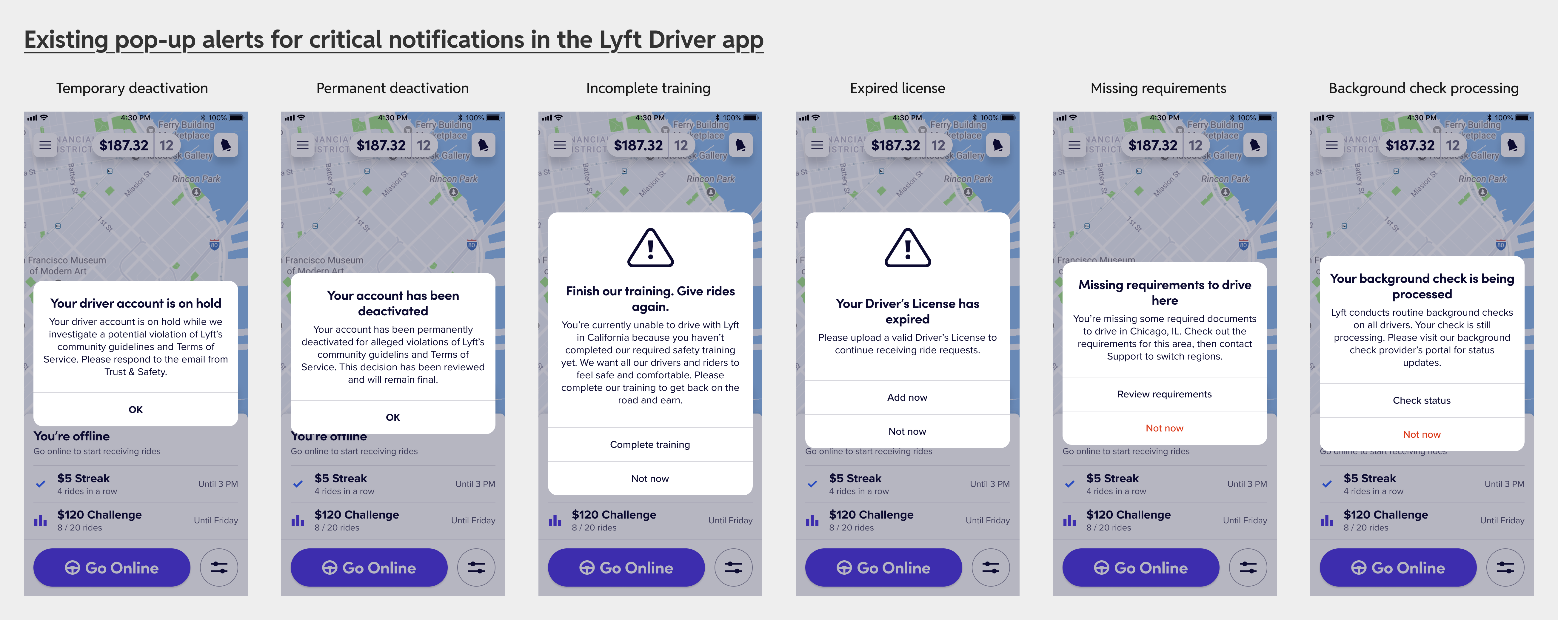
This kind of pattern was all over the app. Every critical message that Lyft needed to send to drivers showed up as a blocking alert on the homescreen without any framework for why and how it showed up. These were account-level blocks that prevented you from earning on the platform but looked like a generic dialog and totally disappeared when dismissed. Drivers got into the flow of dismissing these dialogs out of habit and completely missed crucial information that Lyft was trying to communicate about their account. There was a clear design problem to solve here.
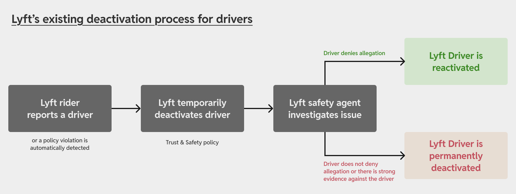
Lyft’s Trust & Safety policy required that safety agents temporarily suspend drivers on account of rider reports, a policy that favored the rider’s word unless contested by the driver. Understandably, drivers did not like this as they never had a chance to explain their side of the story until Lyft reached out to them about it. Tackling this problem required diving deeper beyond the surface-level UI. It necessitated that the process and system design to evolve in a way that was fairer to drivers.
The deactivation process
There were many different reasons for why a driver could be kicked off the platform, some temporary and some permanent. It was overwhelming to tackle them all at once, so I decided to start with the most common and most painful flow.
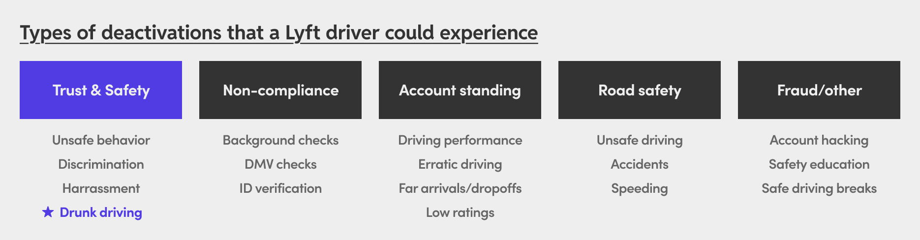
When we looked at the data, non-compliance deactivations were the highest volume deactivation reasons. But digging deeper, I found that the Trust & Safety deactivations had a higher reactivation:deactivation ratio, indicating that many of these were false reports or wrongful deactivations. Drunk driving reports in particular were the most extreme, with 95% of drivers getting reactivated after having been temporarily suspended. I wanted to figure out why this was so high.
It was easy for a rider to report a driver for drunk driving. Too easy. It was by-design a low-friction flow to make it easy for a rider to report a severe incident in a Lyft ride. But the extreme ease with which you could submit a drunk driving report about your driver made it ripe for potential abuse and misuse by bad faith riders. A Lyft agent did try to follow-up with the rider about their report, but the riders would often be unresponsive, leaving the case hanging for days or weeks while the driver was suspended without the ability to earn an income on Lyft.
To make matters worse, the way in which Lyft agents attempted an outreach to drivers was broken and filled with process friction that made it impossible for a driver to get a clear idea of what was happening. This showed me how much waste and inefficiency there really was in our process.
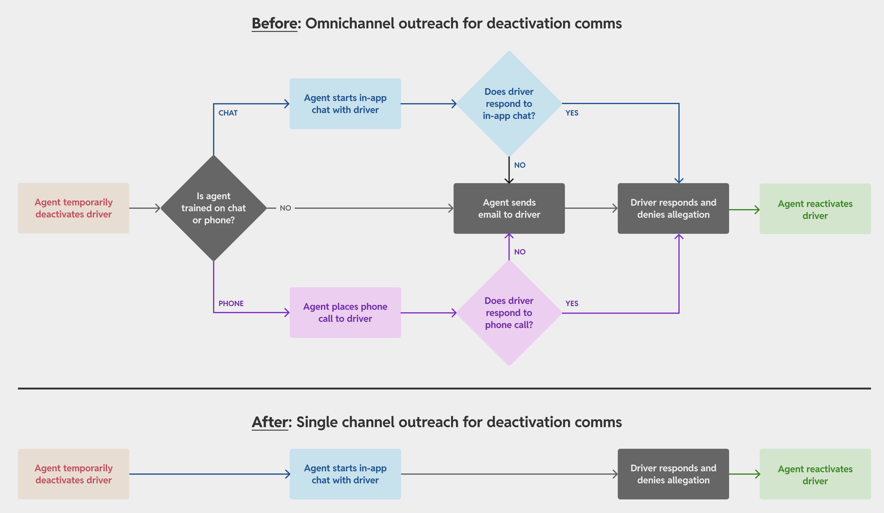
Lyft agents would attempt a driver outreach based on the channel they were trained on (which was often inconsistent). Drivers would completely miss some of this on the phone or never bother to check their email. They would then attempt to contact Lyft again again later resulting in even more missed connections due to how the support system was setup.
I believed that unifying this into a single chat channel was the way to go here. I had worked on a feature to persist chats in the app where drivers could have a continuous thread to keep the conversation going, so I felt that this was the most efficient path forward to reduce work for Lyft agents while ensuring drivers had a single surface to make their case.
Design explorations
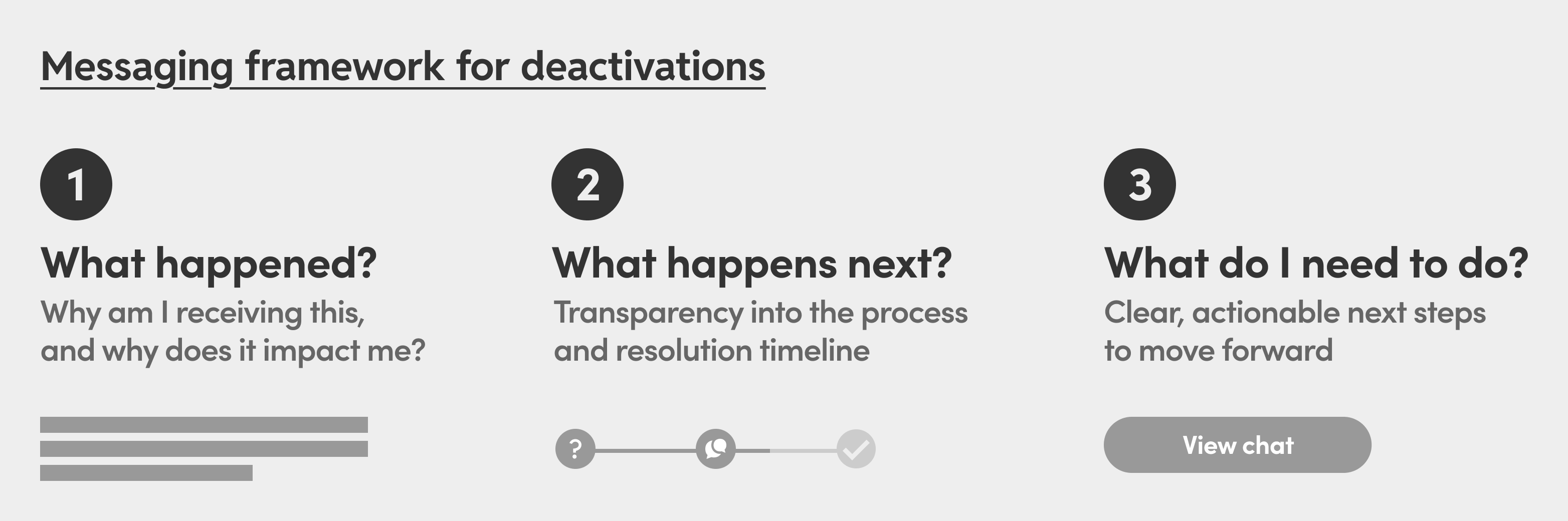
Before diving into the UI, I wanted to figure out what drivers actually wanted to know about the process. We couldn’t change much of how Lyft’s Trust & Safety policy worked, but we could be transparent about what was happening and provide clear next steps. I worked closely with our researcher Carolyn Buehler and our content designer Meghan Shagam to define a messaging framework.
This in turn informed the design principles that I set for the work:
- Transparent: Provide details about case status to maximize clarity
- Empathetic: Acknowledge the situation and provide reassurance
- Actionable: Give clear next steps about how to resolve the issue
I intentionally wanted to avoid principles like surface-level delight here, because this is an extremely sensitive policy and it was appropriate to treat it with the seriousness and urgency it deserved while being clear about what was happening. The main thing to figure out from here was where to communicate the status and resolution of deactivations to drivers.
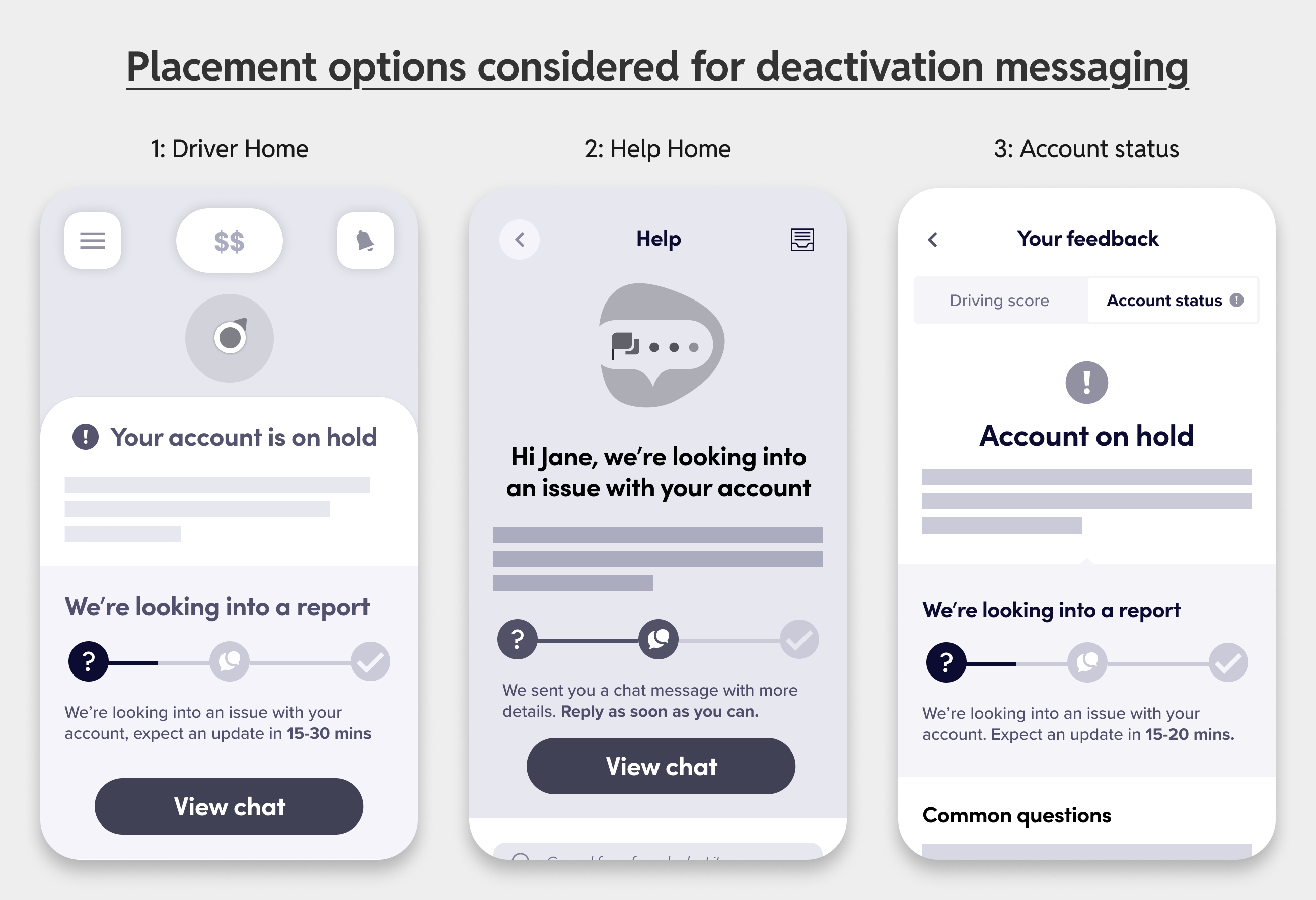
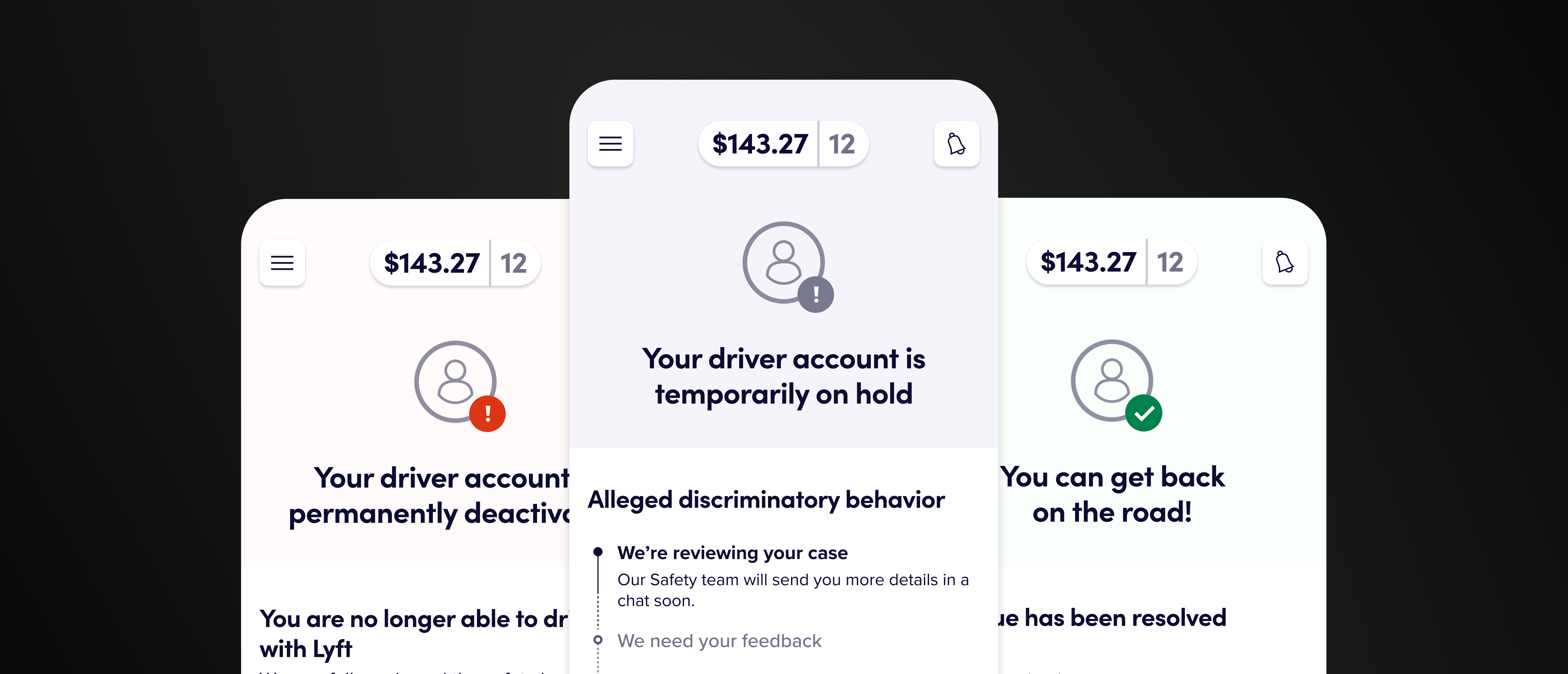
The homescreen was a natural choice because it was right there when you opened the app and blocked actions that you couldn’t take anyway like going online or viewing incentives. The Help or Account screens (accessed from the side menu in the Lyft Driver app) were also considered, but were eliminated because they required a higher level of friction for drivers to navigate to it just to find out the case status.
I questioned the value of seeing the map on the homescreen with the Lyft Driver design team. If you were deactivated, there really was no purpose to it. I ultimately decided that taking over the entire homescreen was the best path forward as it clearly highlighted the urgency of the issue while removing surfaces irrelevant in the moment like the map and incentives to go online. Importantly, we would preserve the important entry points to the side menu, earnings, and notifications with the full-screen takeover.
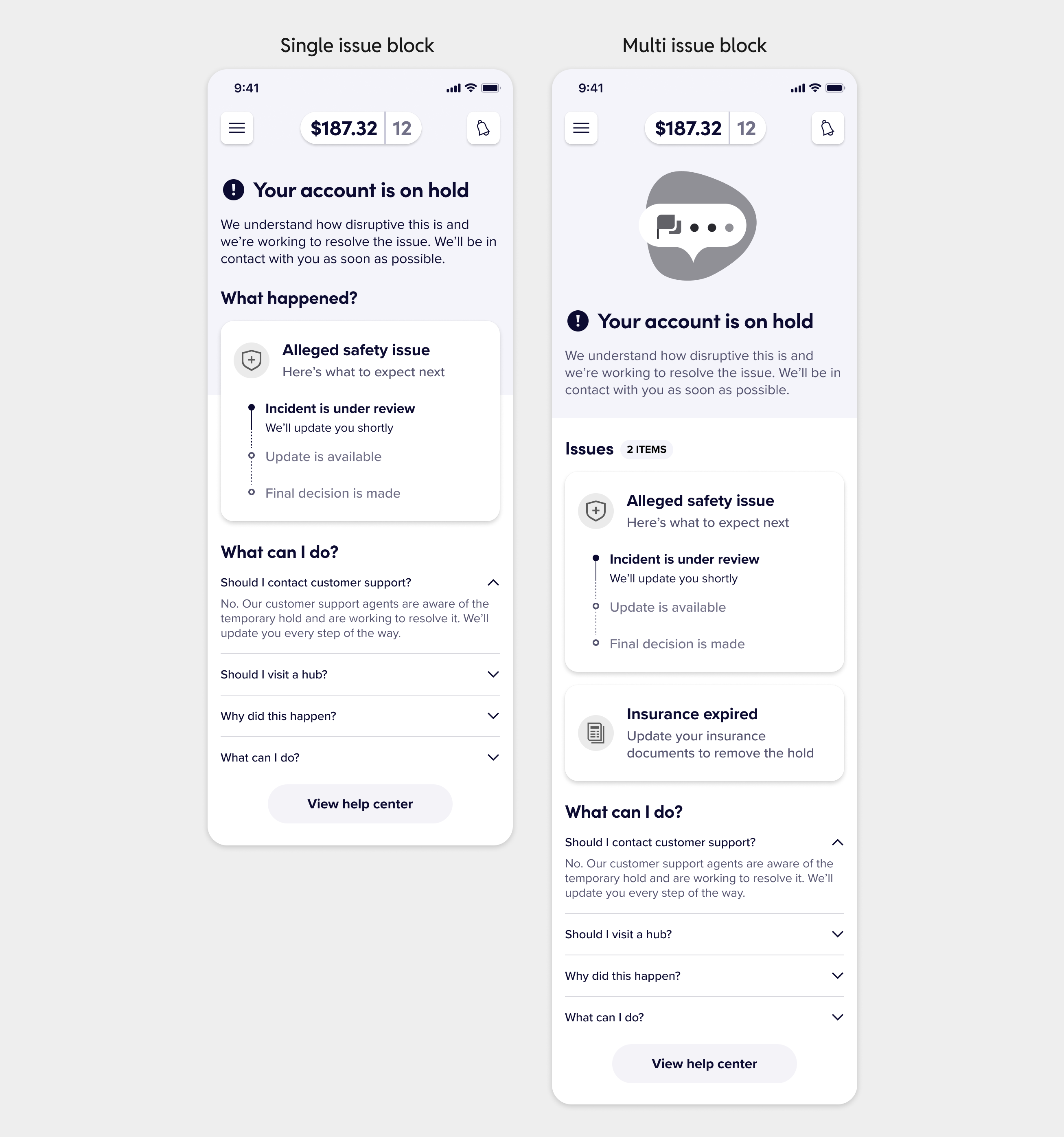
I also needed to make sure this solution would scale to multiple types of issues, so we stress tested this extensively with content variations. I wanted to not have a massive wall of text info-dumping a ton of legalese onto Lyft Drivers, so many of the design explorations here attempted separating distinct content with visual affordances like cards or separators.
The new driver deactivation experience
After concept testing and iterating on the designs over a couple of rounds, we had the designs for how the full-screen takeover would work for the Drunk driving deactivation reason and scale to any Trust & Safety deactivation.
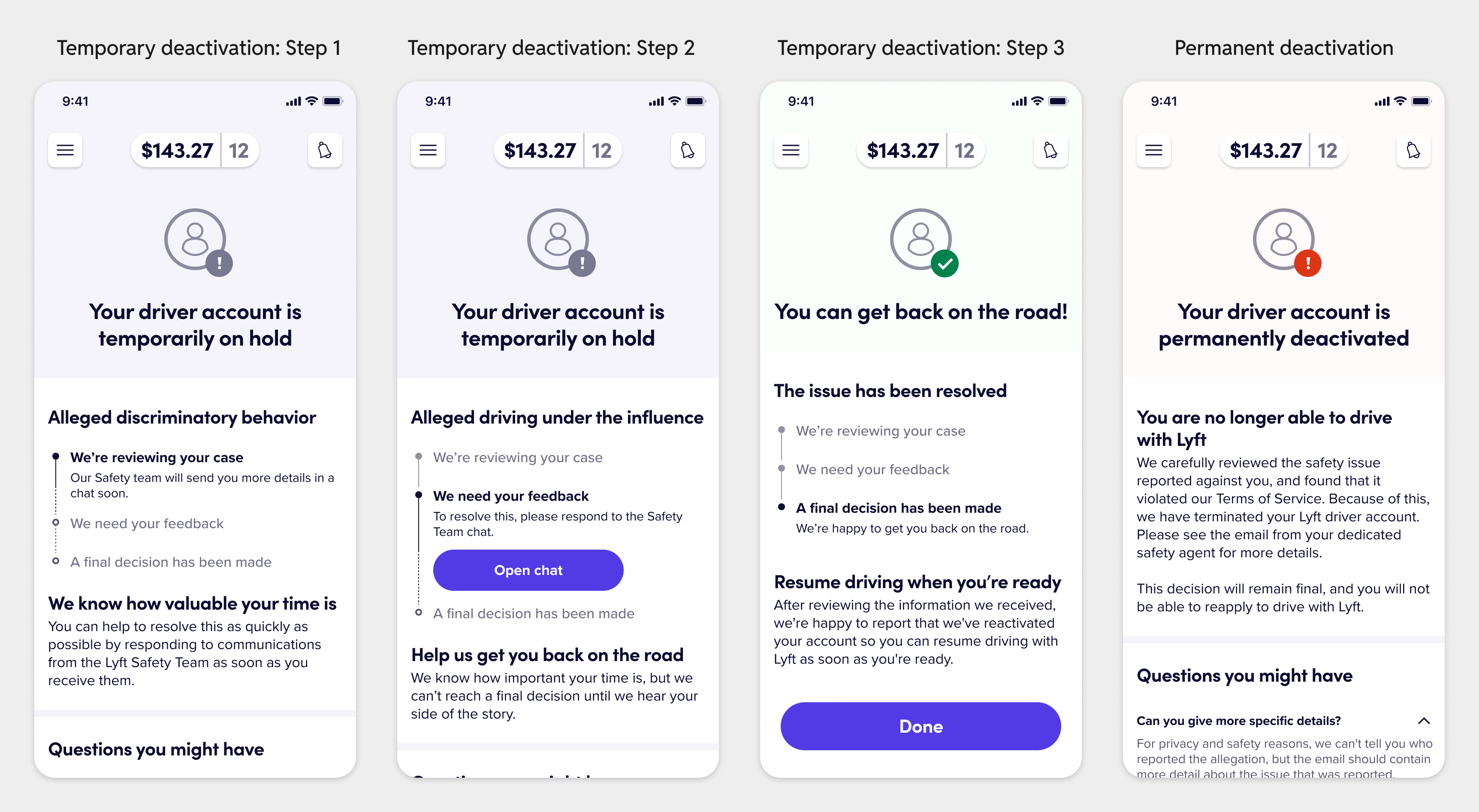
Unifying the deactivation outreach to the chat channel, simplifying the comms into the messaging framework, and using a fullscreen takeover strategy on the Lyft Driver app’s homescreen collectively resulted in big metric wins when we shipped:
- Reduced time to reactivation by 18%
- Reduced time to first response (from drivers) by 10%
- Increased Driver Hours
- Increased Driver Sentiment
Driver sentiment is an odd metric to measure because no driver is going to say that being deactivated is a “good” experience in the first place, but we did get lots of positive feedback in qualitative research about the updated design:
“It is good that it’s right there when I open the app. I like that it clearly explains the steps as to what is going on. I will have a chance to provide my side of what happened”
Beyond the MVP
After we scaled our solution to all Trust & Safety deactivations, the same framework worked for Non-Compliance deactivations like background checks, ID verifications, and DMV checks.
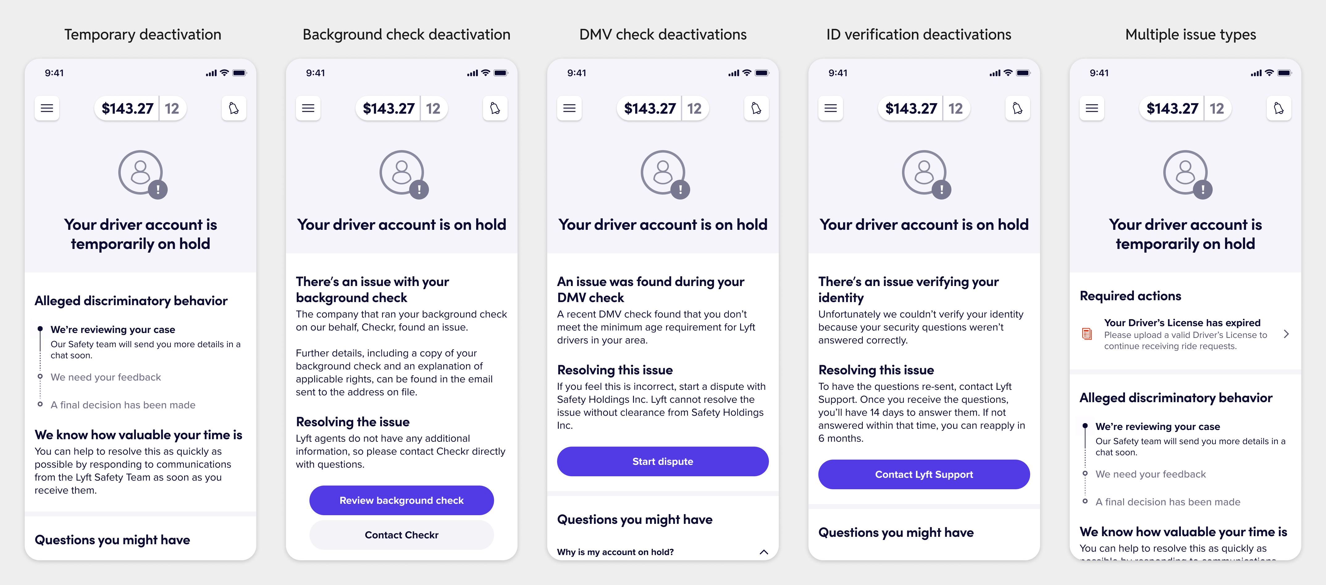
I worked very closely with our Comms Platform and Design Systems teams to create reusable templates for this fullscreen takeover that we could leverage across a variety of scenarios. The design is now being used as a foundation for all critical messaging in the Lyft Driver app.
Lastly, I’m proud of the fact that we were also able to make improvements in the rider reporting flow for specific issues like reporting a driver for drunk driving. Now, riders would have to provide a required description before submitting the report, capturing more nuance about the rider’s actual experience and, in most cases, eliminating the need for the safety agent to attempt reaching out to the rider for follow-up details.
Introducing friction like this in a flow where our goal was to capture every safety incident that happens on the platform is always controversial, but it needed to be done here to create a fairer platform for both riders & drivers. Shipping this dropped the rate of wrongful drunk driving allegations from riders and lowered the reactivation:deactivation rate for drunk driving reports, which signaled that a higher percentage of the allegations were accurate and not false positives.
I enjoyed working on the people and process aspect of this project. There were so many micro-improvements to the deactivation workflows and efficiency gains from unifying disparate steps which all came together to deliver big wins. I had to work across the rider, driver, support, safety, and operations teams at Lyft to get this over the finish line and am proud of how we were able to ship a meaningful improvement for Lyft drivers.