I was the sole designer on this project from start to finish, defining the product strategy, carving out milestones, and supporting the execution. It took 12 weeks to redesign both views and begin rollout of the detailed ride view. This was a fun systems design challenge where I had to ensure that my work scaled to Lyft’s future vision for transportation and payment offerings.
Background
Over a third of support issues reported on Lyft rides begin from a screen called “Ride History,” a view that displays a historic log of all your past Lyft rides. These are issues like forgetting an umbrella or sunglasses in a Lyft ride, accidentally using the wrong credit card (Personal vs. Business accounts) to pay for the ride, or getting charged more than you thought you should have for the ride.
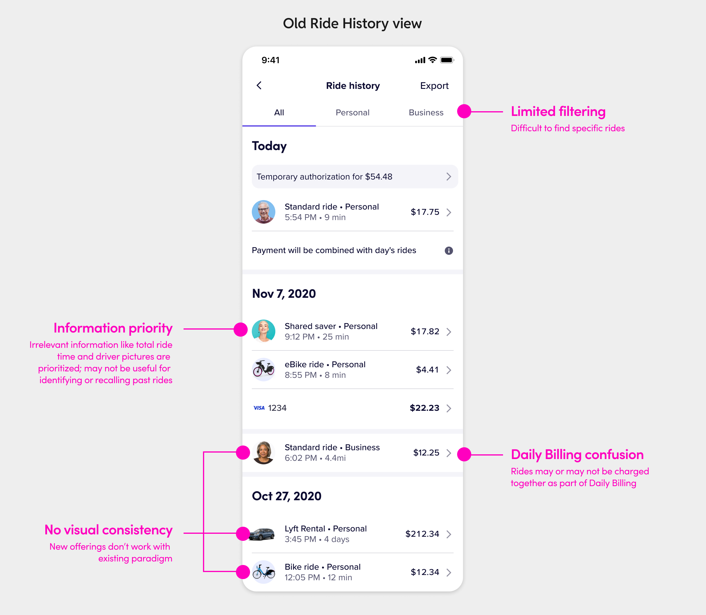
Ride History was not clearly communicating the relationship between the different ride types and payment systems that we had available, resulting in a lot of rider confusion and leading many to contact support from the detailed view of a ride. For example, riders would sometimes get charged for a bike ride and a scooter ride in the same day and other times would see a pending authorization on their card for multiple days that was higher than the ride fare.
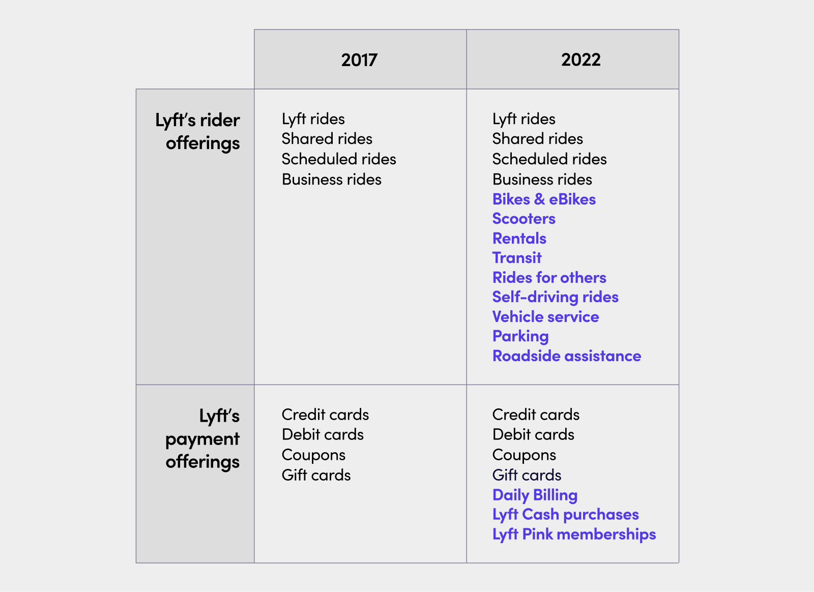
It was also difficult to find specific rides in the view because there was no way to filter or sort the view, and the design lacked visual consistency across the different ride types. As Lyft added more and more lines of businesses and newer verticals, it became even more critical that we had view that could scale and adapt to new information models.
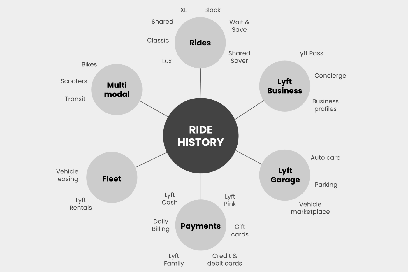
My goal was to unify Lyft’s lines of business into a simplified visual identity and clarify the relationship between rides and payments while also making the view scale better to everything you could do on the Lyft network.
The initial ideation
The problem space was pretty clearly defined, so I wanted to go broad and explore the most complex scenarios first. I did some freeform explorations to test the boundaries of this surface and spark new ideas to inform a direction to pursue with the designs. What could this view look like if it didn’t just show rides and payments, but instead could be a summary of your history on Lyft?
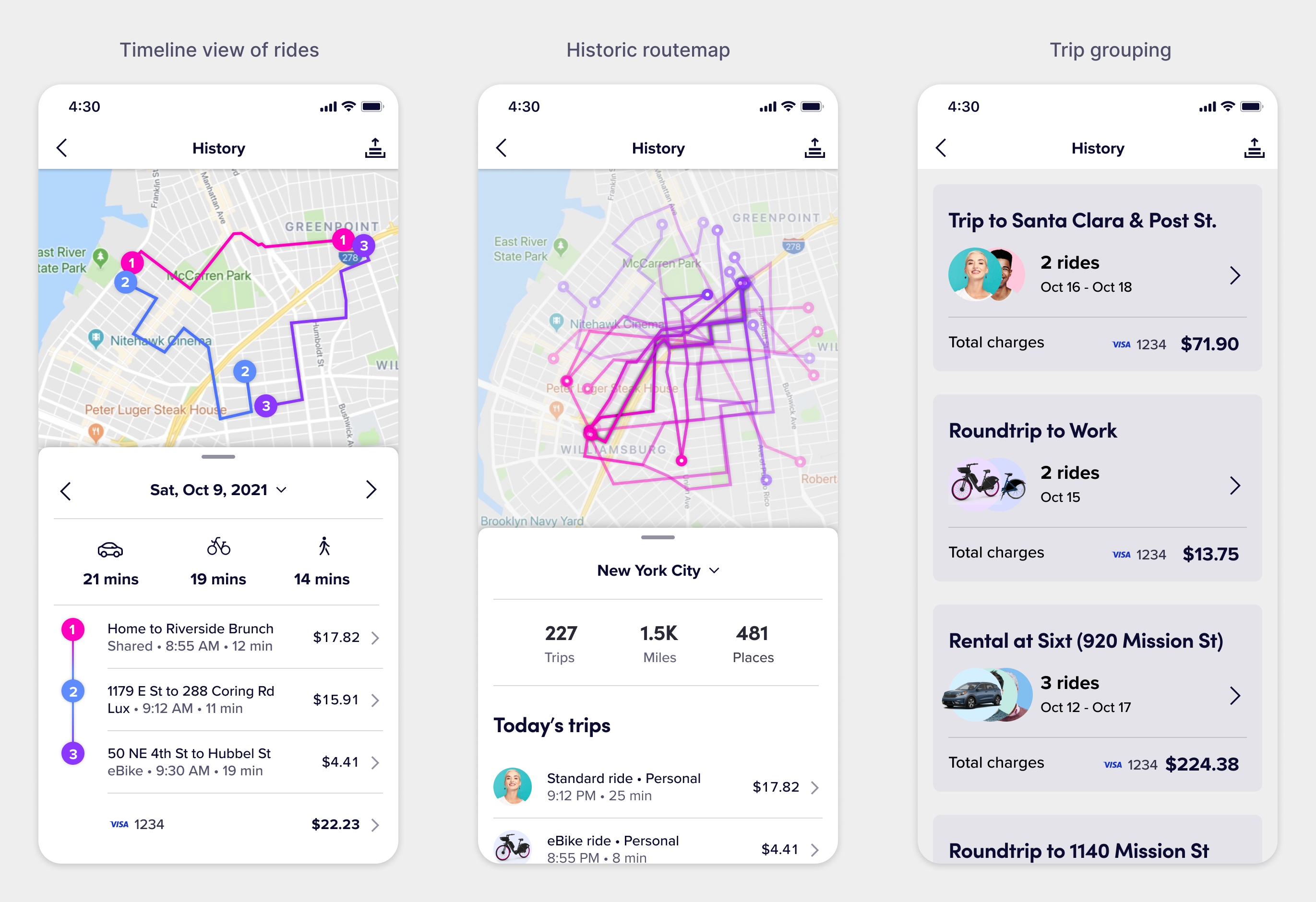
Some of these ideas didn’t really work beyond a conceptual vision, but there was something really interesting about the grouped trips model. Riders usually called a Lyft to a destination and then back home, like in the commuting use case. Trip cards could summarize an entire journey in a day and clearly call out how much that whole journey cost. It’s a shift in a rider’s mental model to think in terms of trips instead of rides, and I wanted to explore this further.
We put the concepts in front of riders for user testing. The imagery-focused approach seemed to work, but at the detriment of clarity. The large, prominent vehicles drew the eye towards themselves and the text calling out the type of ride was getting lost in the mix. Riders didn’t seem to understand why some rows were showing driver photos but others weren’t (like rentals).
When users come to this view, they’re looking to review and find information about past rides. Displaying large vehicles introduced a confusing visual anchor. Riders don’t think of a Lyft ride they took two months ago to the airport in terms of the make & model of the car and it felt irrelevant. So I went back to the drawing board to steer towards familiarity and simplicity.
Lyft History designs
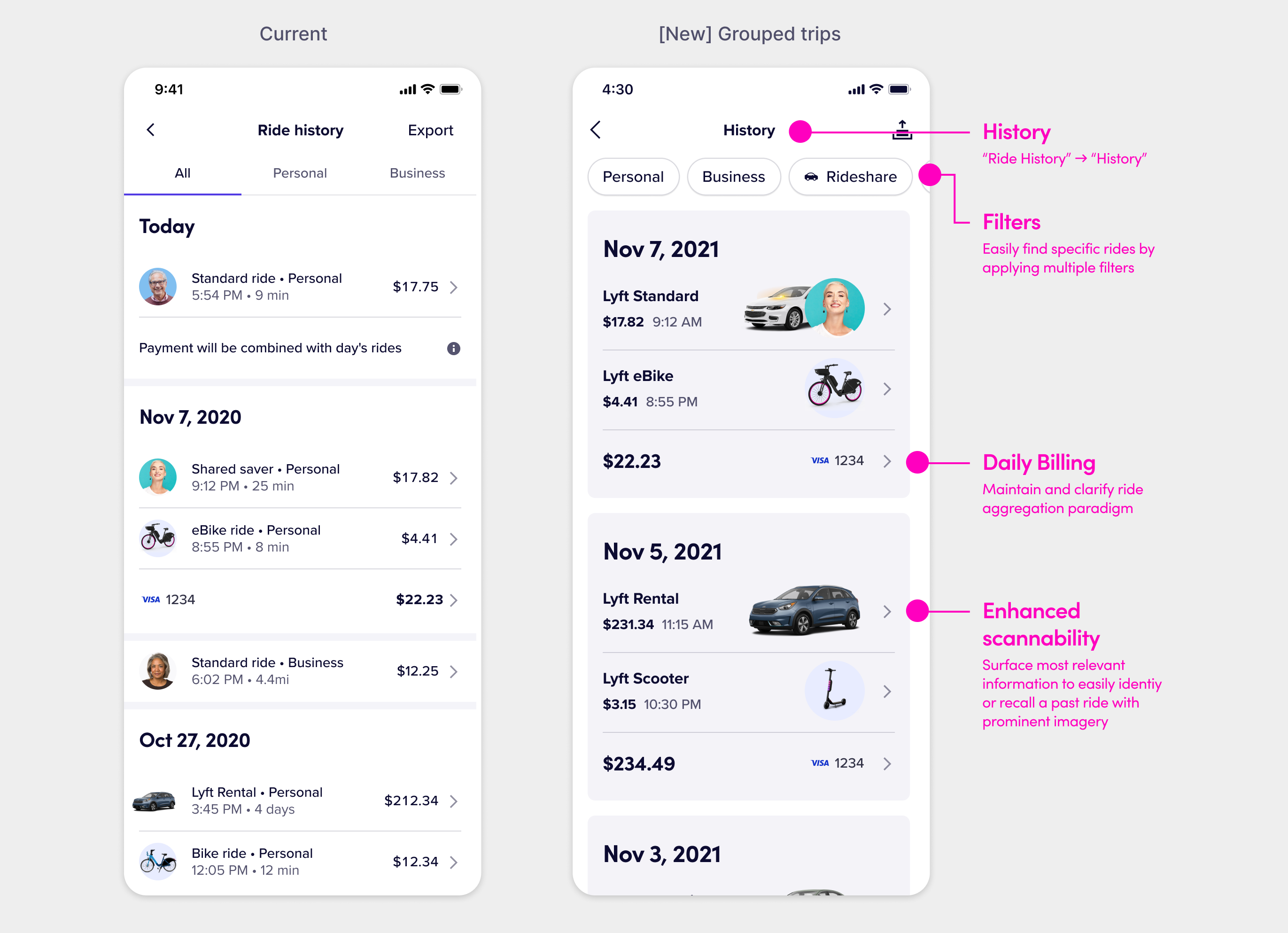
Given the transactional and utilitarian nature of the view, I felt that maintaining a receipt-style information architecture that had clean vertical scan lines to quickly skim and review the screen to find a ride and check its charge would be the most appropriate design direction. To clarify how rides are charged together, I was inspired by social media platforms that use connecting lines to link a message to threaded comments, implying a causality between the items.
A key research finding was that the ride destination was a key mental anchor for recalling the ride, so I introduced the drop-off address into the view as the detail text of each ride to help differentiate rides of the same type. Despite all the mocks showing a wide variety of ride types, most Lyft riders likely stuck to one ride type and commuted back and forth between two destinations.
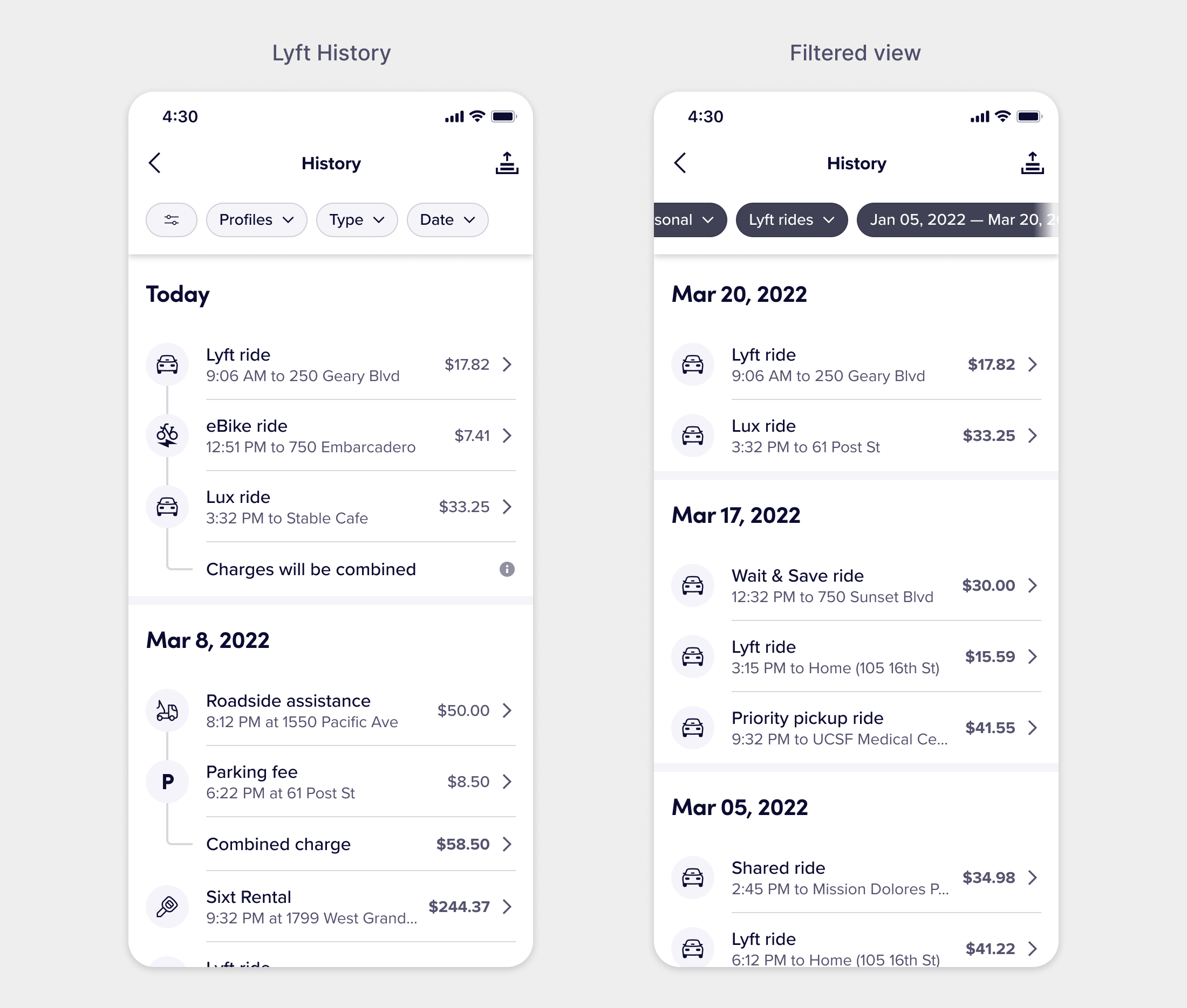
Filtering solved a key use case of needing to report an issue about a ride you took many weeks or months ago and needing to find it in a long list of charges after that ride had passed and you could only recall specific things like the month in which you took the ride. Applying filters would hide the connecting lines between combined charges to avoid confusing the user with missing charges that broke the math.
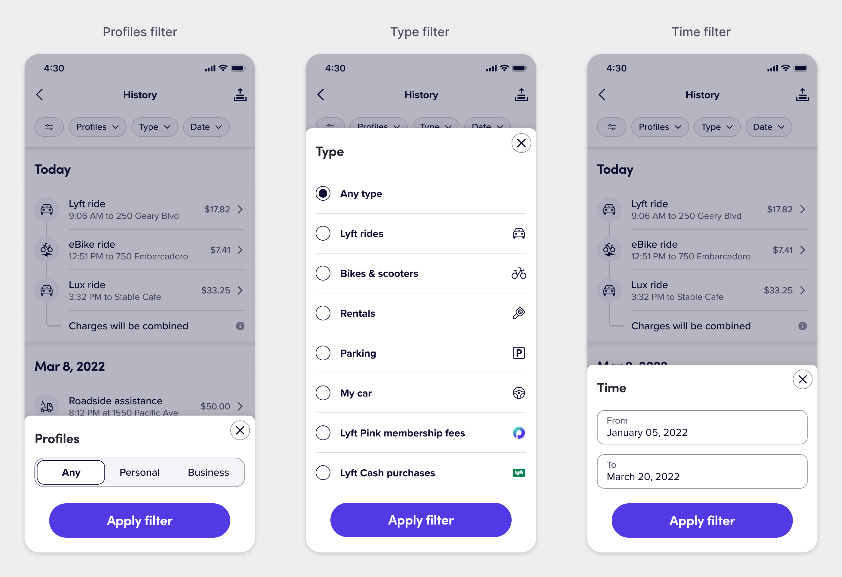
Research interviews revealed that users primarily wanted to filter by Personal/Business rides, the specific type of ride, and a general timeframe with a defined start and end time. This also felt like it was just enough filtering to provide without overloading the screen with too many controls.
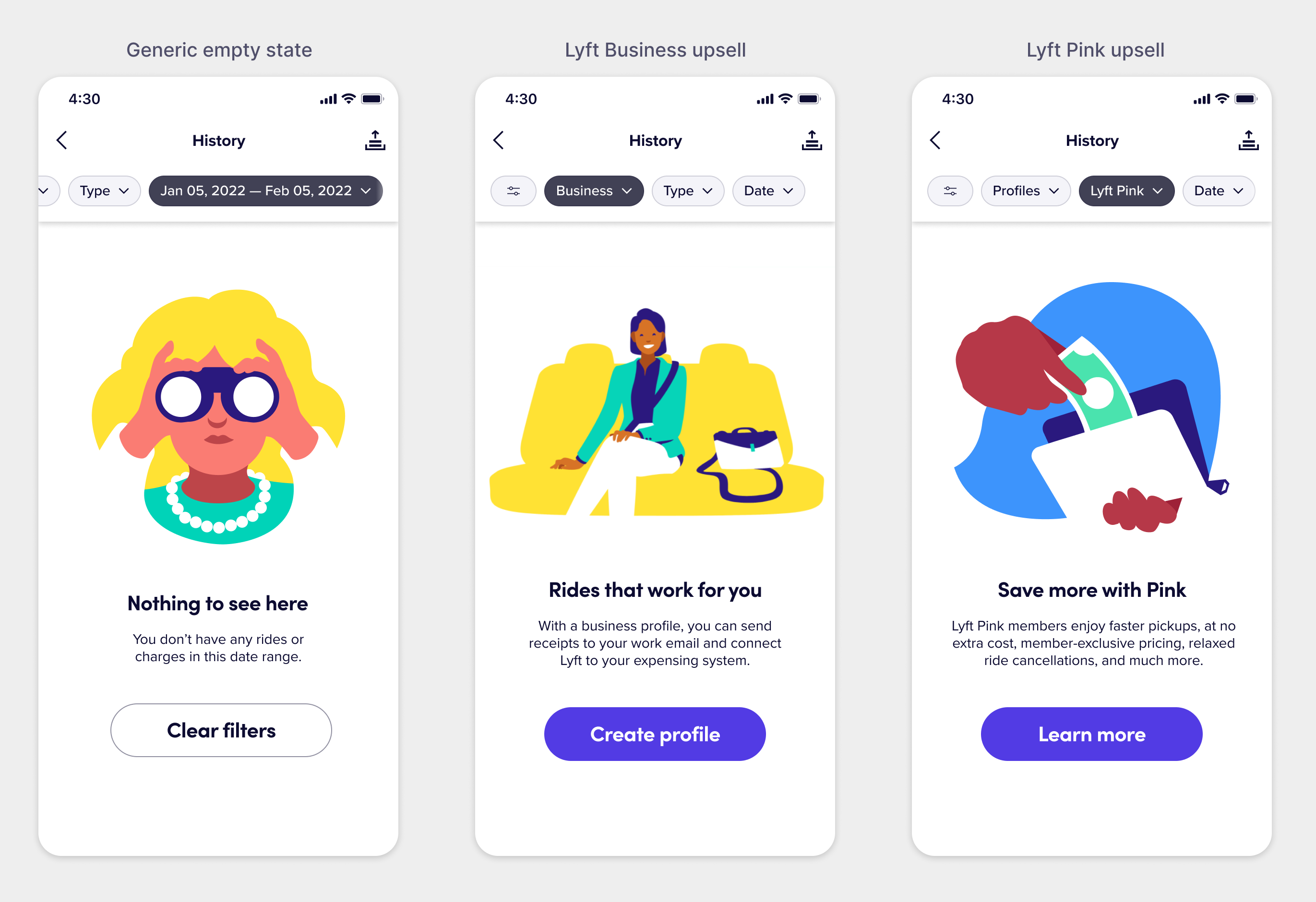
One thing I pushed for and am proud of is leveraging empty states to double as upsells. If a rider didn’t have a Lyft Business profile and filtered the view by Business out of curiosity, they would see an upsell explaining the value prop of Lyft Business that drove them to learn more about it. This became a large driver to users creating new Lyft Business accounts with the Lyft History view doubling as an educational surface to increase awareness of Lyft’s offerings.
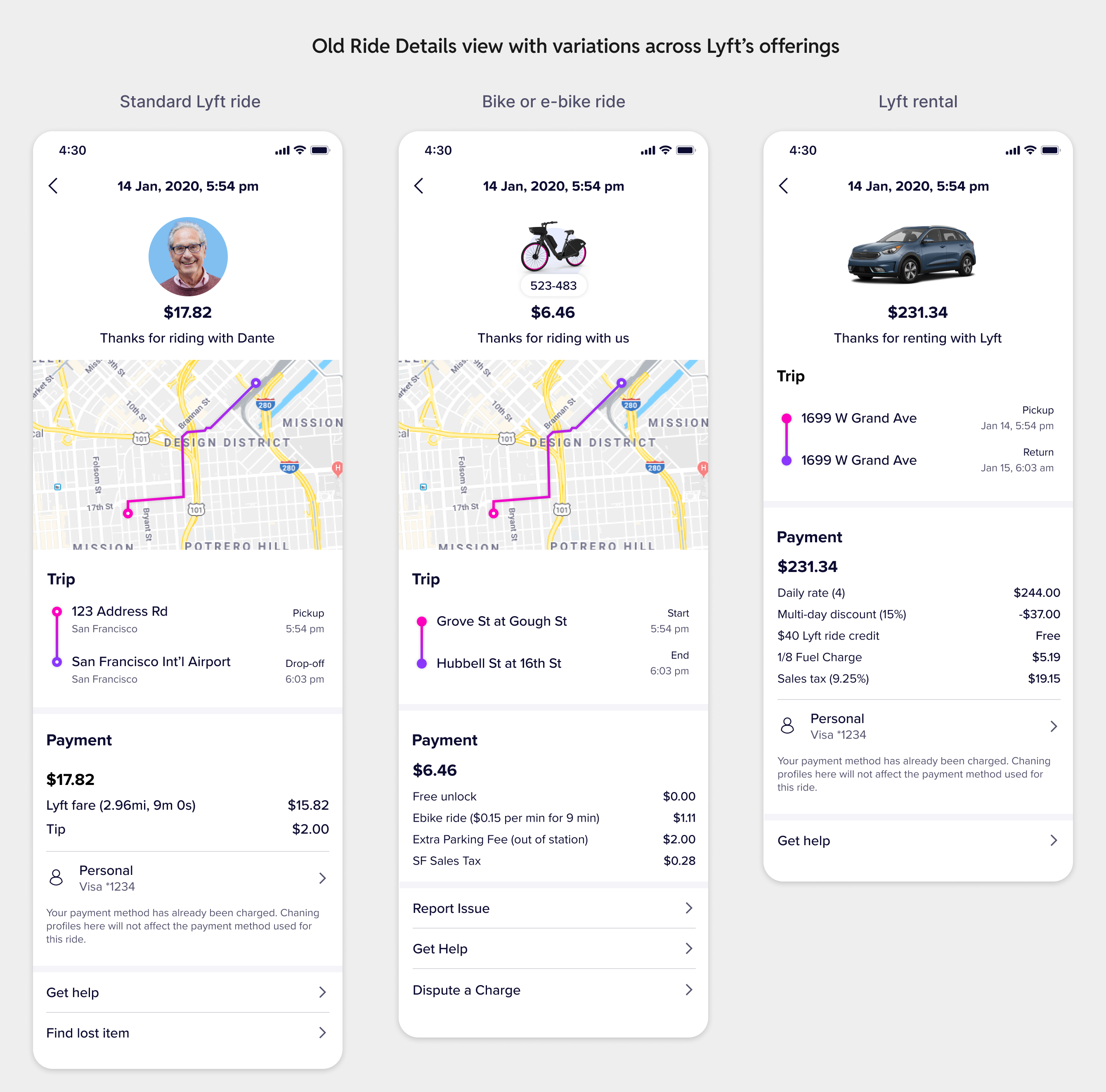
Despite the designs having been completed and handed off, these Lyft History designs didn’t get built due to internal re-orgs and a big reshuffle of priorities in 2022. But before that happened, we were able to make updates to the detailed view which contained the entry point for support outreach, the Ride Details view.
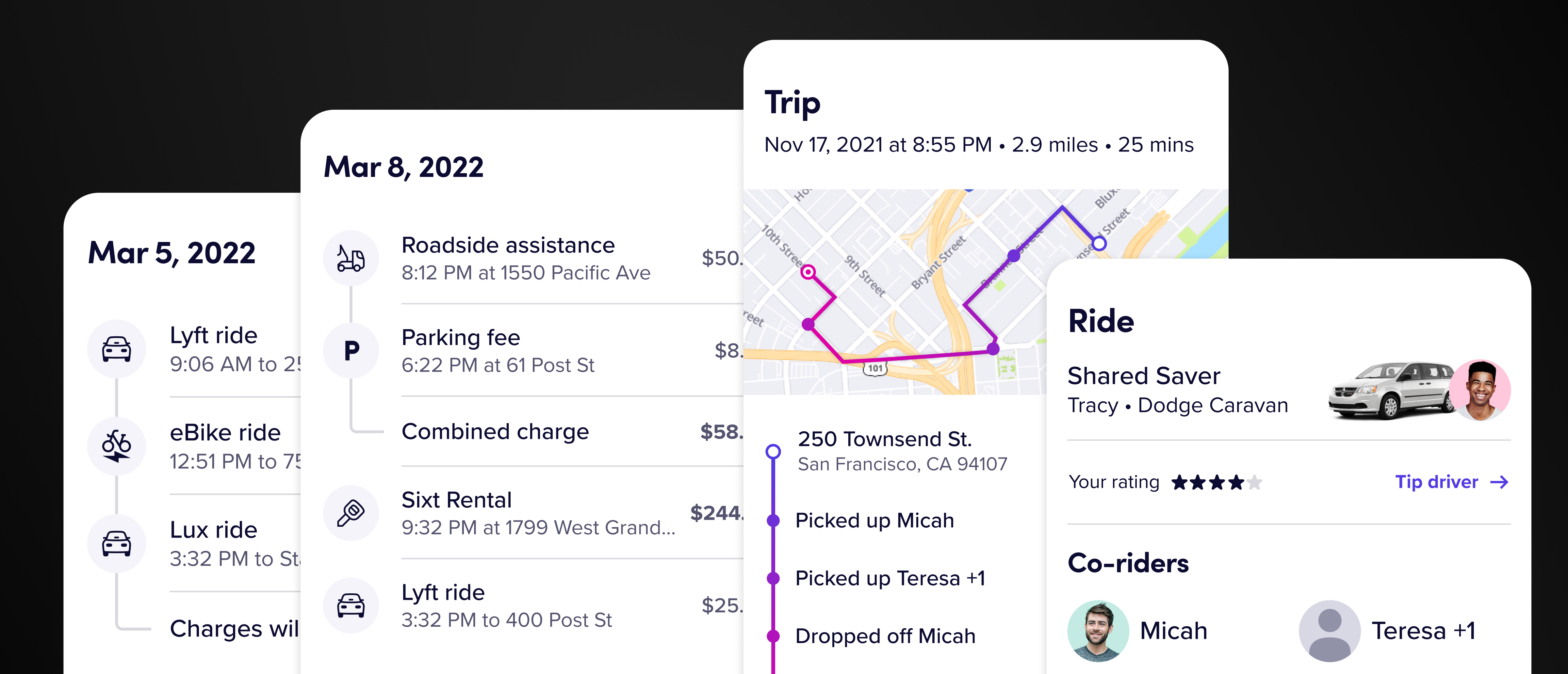
The Ride Details view
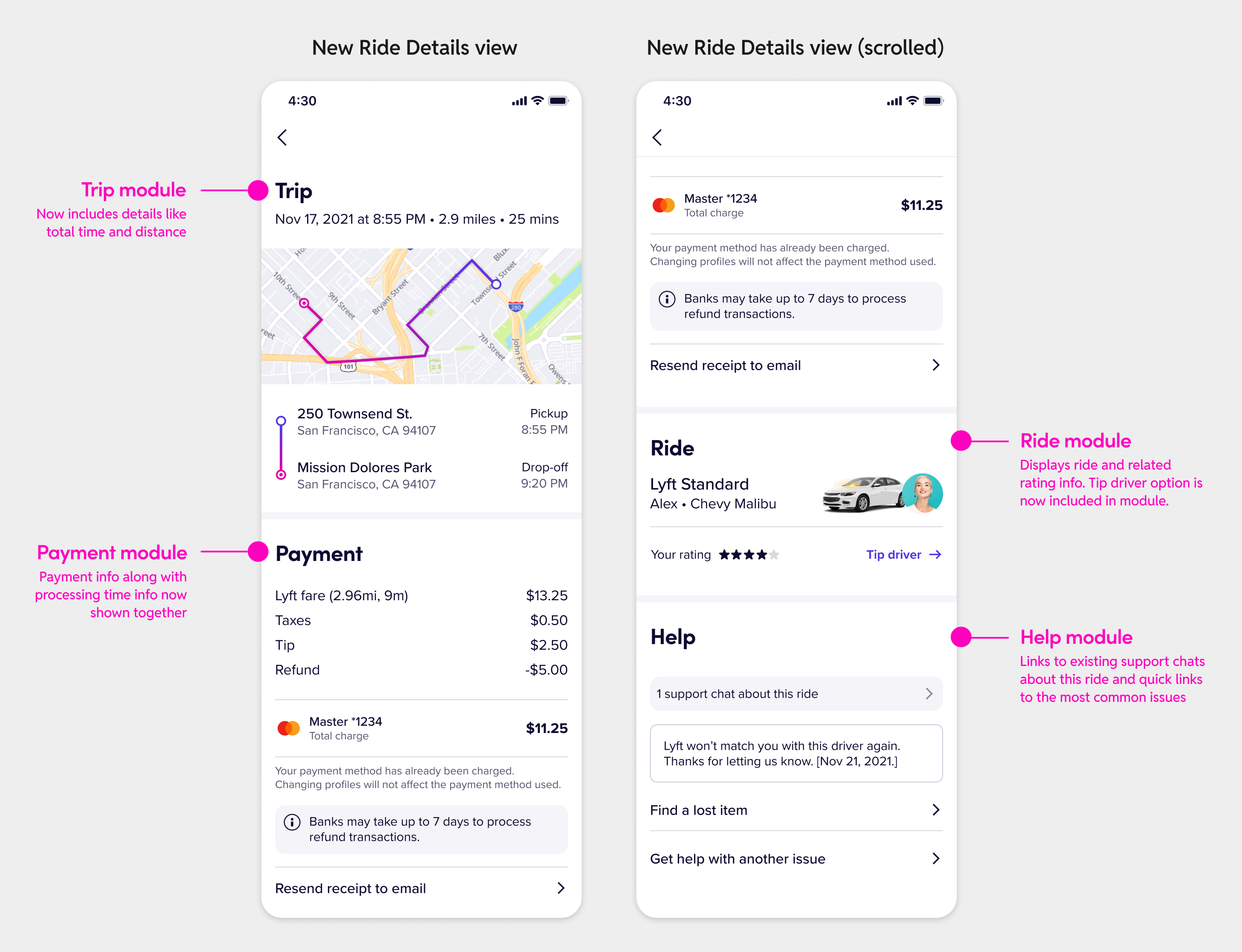
Tapping into a ride from the main Ride History view opened a detailed view of the ride, displaying basic information about the ride with a payment breakdown. This was the screen that had the support entry point, and my core hypothesis was that if this screen did a better job of communicating more relevant information about the ride, we’d see fewer support outreach.
Riders could not view their rating or tip drivers from this view, critical things that they expected to see and do from this screen but couldn’t. It felt wrong that they were coming to this view to thank their driver and we just didn’t allow them to do it. This was a win for Lyft’s business, riders, as well as drivers, so I wanted to bring these into the screen as well.
I restructured the information architecture of the view with a module-based approach that could scale to a variety of trip lengths with multiple riders and worked across many different types of rides. The same methodology applied to the Payment and Help modules.
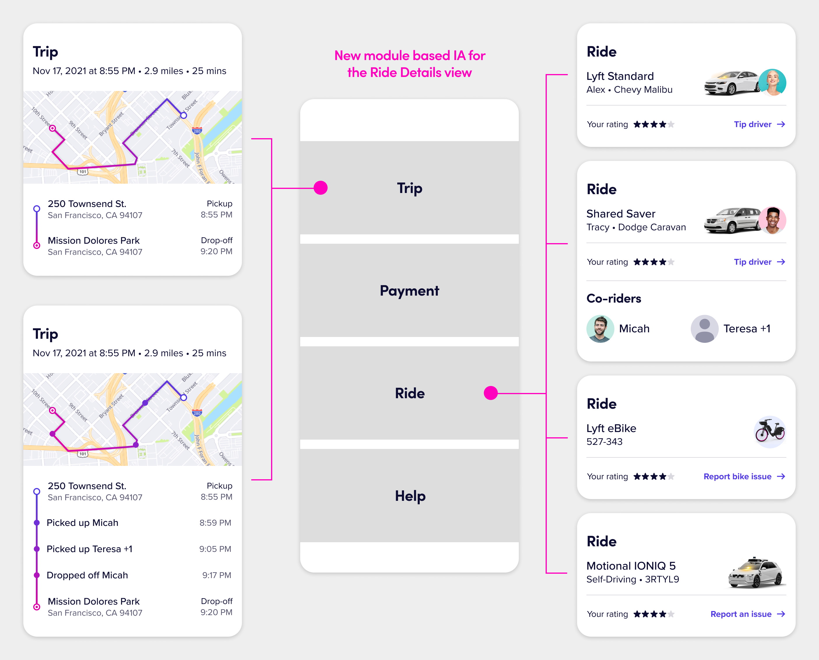
I ordered the modules based on concept testing results, where riders wanted to see trip and payment information first followed by ride details, after which they expected to see support at the very bottom. I embedded links to support in the Ride module where appropriate and also added explainer banners about payments that were still processing (which accounted for a big portion of our support contacts).
The final view felt intentionally structured with relevant actions embedded throughout the screen. We shipped this redesign and saw a statistically significant decrease in support outreach about payment-related issues along with an increase in driver tips.
This was a big win across the board. We had a simplified, scalable design that worked for all future Lyft offerings while also saving on support costs and increasing driver earnings. It also helped make the case to invest in redesigning the main Lyft History view in a follow-up milestone when appropriate.
To learn more about all the nitty-gritty design details and all the complexities involved in redesigning in both the History & Details views, check out the full-length design deep dive on Medium.